Conan and the Tower of the Elephant Pinup- Pencils

Conan the Barbarian- an epic character from Robert E. Howard and an iconic figure in American Artwork on book & comic covers and thousands upon thousands of pages of printed comic books.  Unlike my last series of pinups (Dr. Who Villains) where there is little art to compare to- Conan is an epic order to fill- Frazetta, Buscema, Smith, Alcala, Chan, Boris are just some of the classic legends to tackle and succeed with this Barbarian from another age and time.

The biggest challenge when facing this kind of historical comic character is what I’ll call the “Nord Barrier”- and by that I mean Cary Nord- super artist in general that re-launched this title with Dark Horse several years back.  What impressed me with Cary’s work was that he made his work original and “re-made” Conan all over again  with a fresh style that was unique, as well as beautifully rendered.  I think that Cary pulled this off was made all the harder with so many great artists doing the same thing for decades.  He managed to make the Nord Conan a unique look and feel despite so many hurdles to being original.  So I felt if I were doing a Conan piece I had to make it mine and not a knock off of say- Buscema’s or Frazetta’s etc. and thus cross the “Nord Barrier”.

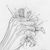
So I took my favorite Conan Story and made my image of two paragraphs from Tower of the Elephant– it was a challenge from the changing poses of the Main character- Conan, and the Spider- below are my 4 steps to get to final pencils.  Here is the passage I took my cue from…

It was as large as a pig, and its eight thick hairy legs drove its ogreish body over the floor at headlong pace; its four evilly gleaming eyes shone with a horrible intelligence, and its fangs dripped venom that Conan knew, from the burning of his shoulder where only a few drops had splashed as the thing struck and missed, was laden with swift death. This was the killer that had dropped from its perch in the middle of the ceiling on a strand of its web, on the neck of the Nemedian. Fools that they were not to have suspected that the upper chambers would be guarded as well as the lower!  

These thoughts flashed briefly through Conan’s mind as the monster rushed. He leaped high, and it passed beneath him, wheeled and charged back. This time he evaded its rush with a sidewise leap, and struck back like a cat. His sword severed one of the hairy legs, and again he barely saved himself as the monstrosity swerved at him, fangs clicking fiendishly. But the creature did not press the pursuit; turning, it scuttled across the crystal floor and ran up the wall to the ceiling, where it crouched for an instant, glaring down at him with its fiendish red eyes. Then without warning it launched itself through space, trailing a strand of slimy grayish stuff.

And now that you have read the text I based this on- I present the pencils, and layout and thumbnails that led to the final pencils.  Lots to do here before I get it complete, but a project to be excited about!  Did I cross the “Nord Barrier”? Well dear reader, that is for you, and not your humble narrator to decide!

*Note- the top scan are some edits I made after the “final pencils” I got some amazing crits on this piece from some killer artists (who asked to remain nameless) and I was able to give Conan a boost, to look, well more “Conan”.  So the first scan are the Conan Specific Corrections, and then the main scan is under that – it was done about 48 hours prior.  I like to share as much behind the scenes stuff as possible so I wanted to show this part of the process pre inks.

CONAN  RE-EDITS

Jason Lenox- Tower of the Elephant Pre Ink Last Pencil Edits


Conan Tower of the Elephant - Jason Lenox


Conan Tower of the Elephant Progress Jason Lenox


Conan- Musculature

2014-01-03 020614


Harley Quinn Commission- Final Inks

The final inks to HARLEY LOVES JOKER

Notes- I really rebuild the face to get more of a sexy look and a pronounced nose, this worked well in my opinion – I also really felt the line weight and solid blacks evoked a style that I love from the old U.K. 2000 A.D. Books from the early 80’s.  If you are familiar with that- chime in to give your opinion!

I also changed up the Heart’s in the middle and just made it say LOVES- it was unclear to the public what I was trying to get accross- so it had to change!

Overall, I felt a solid composition and execution on a fun commission for a client!

Harley Loves Joker by Jason Lenox small edit


Thanos Commission- Final Inks

The final inks for my Thanos Commission. The inks really brought out the details and made this piece pop. The facial texture really did it for me, I liked this from the major composition and layout to the final details.  I tried to take my old school Role Playing Game inking style to a Marvel Hero, I think it worked well to take a new take on an old character.

THANOS low res Edited Jason Lenox


“Attack on Titan” Pinup – Final Inks

The final inked version of ATTACK ON TITAN that I made as a pinup- the detail really turned out gorgeous for the Titan, and Survey Corps horseman, and even the man in the high background getting squished! The Attack on Titan Manga is very un-detailed (but highly fluid in motion) so I had to really go over volumes 5&6 to piece together the anatomy of the equipment, uniform and gear for the cavalry rider, and even the Giant body details on the Titan- Hajime Isayama really has some things spelled out in some panels and others are left to the imagination, and then the next panel is completley opposite in terms of what is shown in detail and what isn’t. So to get a full picture, I needed to look at various reference points constantly. This made it hard to really attain the accuracy and level of detail in my style, while keeping it true to Hajime Isayama’s original designs. The details really fleshed out the composition in the end despite the lack of solid reference…or un-fleshed it in the Female Titan’s case. I felt the rider’s Jacket and the Giant’s face really were stong elements of this piece. Ironically the hardest part to ink was the shoulder patches on the rider’s jacket. The Survey Corps has a very complicated logo, and I really tried to nail it. I would have never thought that would have been as hard as it was, but indeed it vexed me.  Well I hope all of my anime friendly fans enjoy this as much as I did creating it!

Attack on Titan by  Jason Lenox


Harley Quinn Commission- Pencils

Another cool commission from a fan who asked me to do an interpretation of DC Comic’s Harley Quinn, the girlfriend of the Joker.  I was surprised to see her new costume was more of a roller derby girl as opposed to her old Batman the animated series jester outfit, but hey, times are changing!  I may tweak some of the facial expression, but at the same time, I like the odd expression that came with the smile and stare I was going for in a psychotic killer’s psychotic girlfriend….

Enjoy!

Harley Quinn Jason Lenox


Thanos Commission- Pencils

Just a short and sweet Thanos Commission I’m doing for a fan I met at a store signing.  He is collecting different artists doing their own interpretations of the classic Marvel villain.  I’ll always identify Thanos with the following four items as visual keys…

#1- The Infinity Gauntlet

#2- The 70’s Anime inspired helmet

#3- the psycho eyes and ever present smile

#4- the wacked out ribbed chin

I put all of them in the piece, and had a nice overlap of hand over face and shoulder to build depth. The piece ended up being a fairly simple, but effective composition to get what I remembered about Thanos into one coherent pinup.

Thanos by Jason Lenox


“HELLBENT FOR INKING” 2014 Jason Lenox Convention Tour Tee Shirt Artwork

2014 means some awesome conventions that I’ll be at, and since I identify as the “Metal Artist” on the con circuit, just like last year, I needed a metal themed tour shirt for the fans, and this year is no different- and super local graphic artist Andy Mylin took my wishes to make a JUDAS PRIEST Themed Jason Lenox shirt into reality with some of my recent artwork.  Here is the new Shirt Artwork that will be for Sale as tee shirts starting in January of 2014 via my website or with me at comic shows at my table/booth. Below are the Front and Back artwork for my 2014 theme “HELLBENT FOR INKING” and the art from Priest’s album “HELLBENT FOR LEATHER” that Andy used as a template is below all of that.

Check out Andy’s website here and contact him if you need some great graphic design and artwork in general if you dig his style- I know I do!

Enjoy some killer tee shirts in a few weeks from yours truly!

FRONT

Jason Lenox Judas Priest Theme Tee Front


BACK

Jason Lenox Judas Priest Theme Tee Back


Original Judas Priest Album Cover Artwork

Judas_Priest-Hell_Bent_For_Leather_(2001)-Frontal


12/19/13 – Nude Figure Studies in Pencil with Model- At Art Alliance of Central PA

I could tell this session really went well for me, I was very pleased with my pieces from this week, I think the rust finally came off from missing figure drawing for a few months- enjoy.  And very impressive from this week’s new model who held some obnoxiously uncomfortable poses for decent amounts of time.

2013-12-22 233249

2013-12-22 234048

2013-12-22 233148

2013-12-22 233938

2013-12-22 233517

2013-12-22 233744

2013-12-22 234204

2013-12-22 234445

2013-12-22 234308


“Attack on Titan” Anime Pinup – Pencils

So my newest pinup is based on a Manga I am reading called “ATTACK ON TITAN” Which is basically a post apocalyptic future  where humanity lives in a walled city as the Earth is over-run by cannibalistic giants that eat people.  Right now I am on volume #6 and I quite enjoy the series.  As I work on building up my folio, I have an anime con coming up in January 2014, and I know this show is popular (it’s an anime as well, which I have not watched yet) so it should be a hit at shows, and since I like it… and who doesnt like cannibal giants…. I decided to do this piece as my newest project.

The layout and pencils took about a week to get where I wanted them- volume 6 detailed a new Giant that is a skinless woman, who is smarter than the average giant, and alot of the issue is her killing the “good guys” the SURVEY CORPS of the last bastion of humanity as they ride a bunch of horses around towards a forest- they use horses to get around, and wires with guns to launch the hooks from their hips to stab the giants in their necks… go read it or watch it to find out more on ATTACK ON TITAN… but I digress.

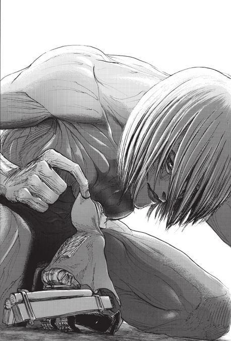
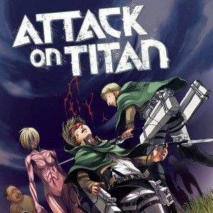
Anyway, I wanted to give the size of the female giant in this piece and at first in my thumbnail my thought was to go over her looking down with the soldiers on their wires trying to cut her- see below I didn’t think it worked.   Then I went with a straight forward Giant woman crouching with a horse running at the viewer- straight on, and not dynamic at all, but I liked the elements- then later that day, I was brushing my teeth, and just saw the thumbnail of the crouching giant in my head and moved my internal camera to the left and down and looked up- and saw the image rotated in my head. I made a rough sketch of the giantess from a worm’s eye view as a rough sketch, then made some traces of my rough sketch of the giant and a sketch right on tracing paper for the rider so I could move his image around on top of the Giant. After I was satisfied with the composition, I cleaned both images up , and then transferred it to a board and did the detailing.  Now this book has kinetic art, but weak on the detail, so I had to really guess and dig to find out the layout for the uniforms and monster body.  Id love to ink this book for the artist/creator Hajime Isayama and give his excellent layouts some of the detail they deserve, probably not going to happen, but It can’t hurt to dream a bit.  Enjoy the pencils, especially the guy getting crushed in the giant’s hand.  Take a look at the hand closeup below the finished pencils… it was fun to make that gruesome detail of the twisted and crushed limbs, I always love finding details like that in other artist’s work so I like to pay it forward to other fans to find this sort of thing. So be on the lookout…. Ill be inking this piece soon!

Attack On Titan Pencils Lenox

Attack On Titan Pencils Lenox - Copy


2013-12-15 012804

2013-12-15 023048

2013-12-15 012220


2013-12-17 214609

2013-12-17 214348

Reference Material

utpor-attack-on-titan-vol-5-vol-6-L-TwUZaz

30

attack-on-titan-manga-vol-6


Davros and the Movellan-Dalek War Pinup – Final Inks

Well my fifth and final Dr. Who piece really turned out well in the final pen and ink version.  Once I realized that the Black would be dominant on Davros’s person and life support machine, and the outer space background would be pure black and made a tactical decision to use Black as the dominant color for the nuke and Dalek killing Movellan POV.  The center Dalek in full black with a “nuke flash” in the background was a fun way to do a Dalek differently, and the Movellan really pops with the black outlining the Dalek eye stalk and gun framing the beam cutting the figure.  On a smaller note the pen and inks also really made the little details like the wires and screen partitions look really stylish as well. Overall, this piece worked for me, and was a great send off to my 5 piece Dr. Who series.

Davros directs the Davros and Movellan War Lenox Small


WP Like Button Plugin by Free WordPress Templates