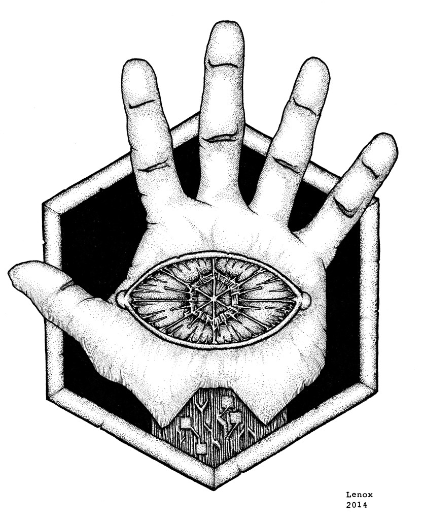
Extreme contrasts from black to white really made this insignia stand out. The plain flesh of the hand with the obsidian background are offset by the high contrast micro details in the circuit wrist and electrical eye. I really think when this graphic is plugged into some characters costumes it will all come together as I am laying the graphic arts groundwork on the new “LORDS OF THE COSMOS” Project with the most basic of components- the logos for our villains, and next the heroes!
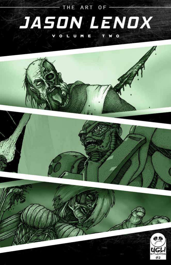
Art of Jason Lenox Volume #2 – Cover
So here is the new cover for my latest project- THE ART OF JASON LENOX VOLUME #2 ….the follow up to my first art book in 2012. Which now make it a series, and that is really cool.
So- if you are reading this, and dig my work, and you know that is a killer cover, hit up the kickstarter link here and donate a few bucks and get some awesome swag from yours truly!
I also want to give props to graphic arts student Aaron Wharton for the execution of this in Photoshop, I would be lost without his expertise.
You can read Aaron’s musings at
@unicorncarcass
www.facebook.com/thegreydesigns
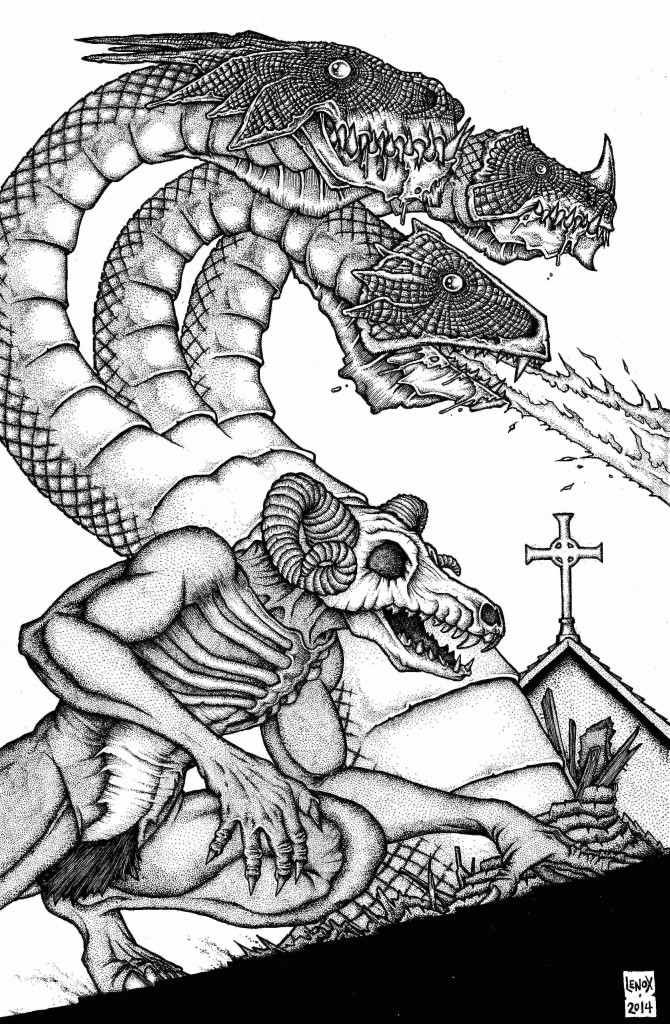
Barron the Demon and Hydra Pinup- Final Inks
Here is the final inked version of this pinup- the biggest insight I can give is there was an old fake leather product my Grandmother had on a purse that I didn’t care for- it looked and felt weird- so I tried to mimic that on the Hydra’s heads for an otherworldly texture that also offset the lifeless eyes. I also gave Barron’s skull head a tweak to make it more 3 dimensional- it seemed off in the pencils with the head more a straight profile and the jaw on an angle- so I balanced it out. His right hand was altered as well in the inking phase to make it more realistic as well as creepy, It seemed to go from a weak element in the pencils to a strong one in the ink phase. Enjoy – and check out Joe’s book here– it got funded at over 100%
Really pleased and proud of how this turned out, and another Lenox Dragon is always a good thing to see…. Enjoy!
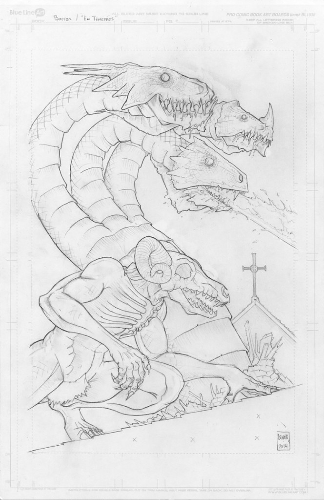
Barron the Demon and Hydra Pinup- Pencils
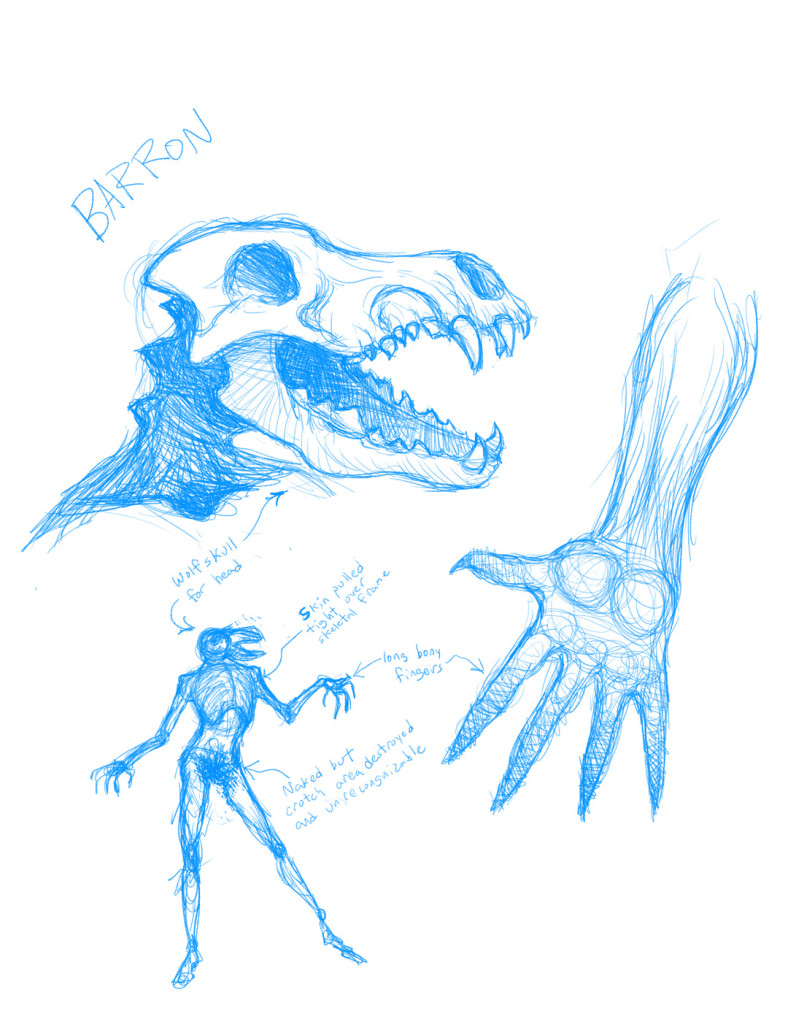
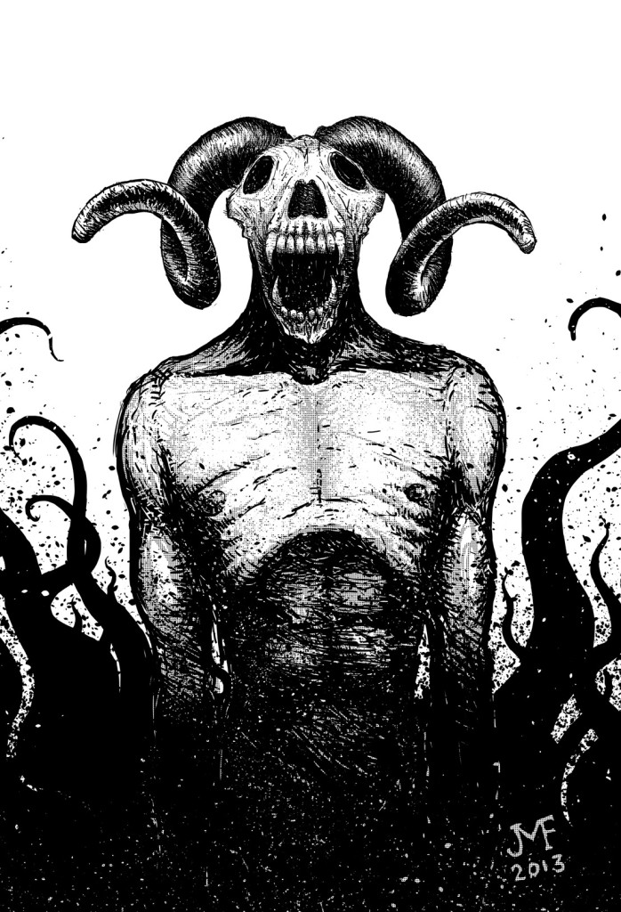
Joseph Freistuhler has been involved in both of my comics, and now as part of our UGLI STUDIOS banner he is making his own comic project called EN TENEBRES which he is currently running as a KICKSTARTER HERE. I was tapped by Joe to do a pinup, and I wanted to focus on his Demon character known as “BARRON” which Joe had some really cool character designs on.
I wanted to draw another Dragon for a while as well, so this was a great chance to shoe-horn a Hydra into the mix. The “story” I am showing in this pinup is BARRON as a high officer in the “ARMY OF HELL” and the Hydra is BARRON’s living weapon of mass destruction. To give the piece a setting I have BARRON and his Hydra destroying a church in the middle ages, because what else do Demons that have Hydras with them have to do in their free time?
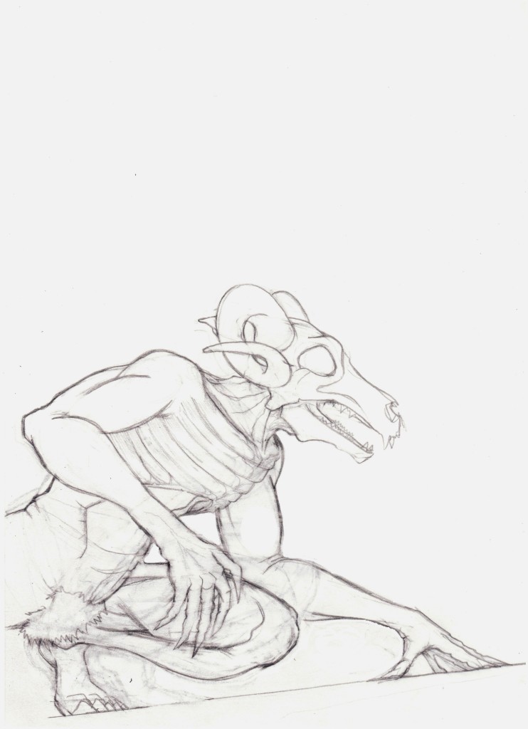
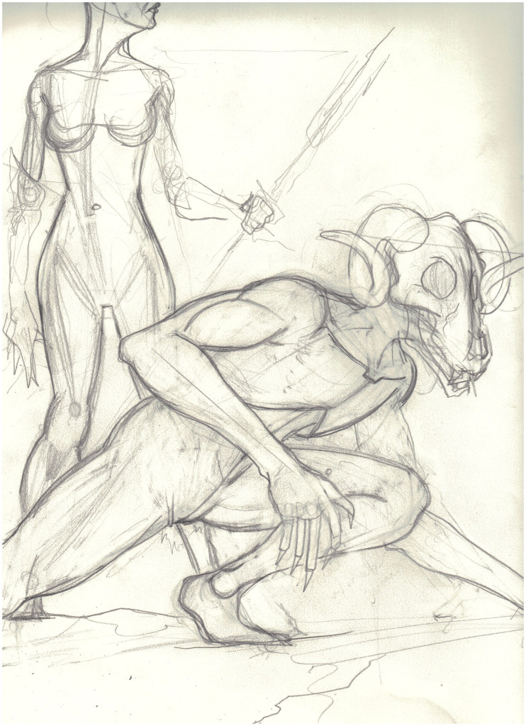
Visually I really wanted to make BARRON seem like a feral animal moving quickly while also showing he is really strong, and I think he really ended up looking like a fast moving creature stalking/running/crouching on that roofline. Part of this in the thumbnails to final pencils was bulking him up and getting his head down to more of a crouch pose. He also has really long creepy forearms as well which added to his unnatural aesthetic. I really had fun with his chest, which after it was done reminded me of the Alien’s chest from the 1979 film of a creepy exo-skeleton which was a second sub-conscious thing. One element you can see in my sketches was he was going to have a gorgon with a trident behind him, and this just didnt work from a layout standpoint for me, so she got dropped- I’m sure the monster union will file a complaint and protest with me.
I also really wanted to duplicate the great time I had creating my Dragon I did as a pinup for Kantara in 2012. That piece was really fun for me, and the fans have really connected with it and I get asked frequently “WHEN IS YOUR NEXT DRAGON?” so I present the newest “Jason Lenox Dragon”. At the same time I needed to do it differently, so creature design wise there are three big changes with this Hydra to the 2012 Dragon
#1 Three odd heads with different outcropping and features as well as breathing fire. I wanted to make these heads less natural and more freakish to show they had “Hellish” origins. I also felt like I channeled some old school Godzilla monster into the heads the center head sort of looked like a Godzilla foe (KAIJU!!!) that had a big knife for a head I liked as a kid- I realized this after the fact, so it was a second sub-conscious thing.
#2 The Hydra has blank “dead” eyes which I pattered after deep see fish that don’t see much light- thus just white plates with no pupils. The blank eyes always were an element that creeped me out, whereas the 2012 Dragon looks smart and cunning like a crocodile, the Hydra just looks like a mindless killer- again, it’s Hellish origins as a slave creature made by Demons like Barron to just wage war and cause indiscriminate destruction on Earth go along with this visual cue.
#3- The snake like body on the Hydra as opposed to the turtle like legs and the stout body from the prior Dragon. The lack of legs all adds to the malformed/un-earthly/hellish look I was working to achieve with Barron and the Hydra.
Visually the final element that just worked was the cross on the building, it was sort of a tribute to when Todd McFarlane made comics- he loved throwing that as a visual element into SPIDERMAN as well as SPAWN- I always loved his work and am still inspired by his ability to make things look fabulous, so with Demons running on a church roofline, I felt it was a fun wink and a nod to fans of Todd’s work from me to them.
Here are the final pencils, my thumbnails and Joe’s original Character Designs for BARRON.
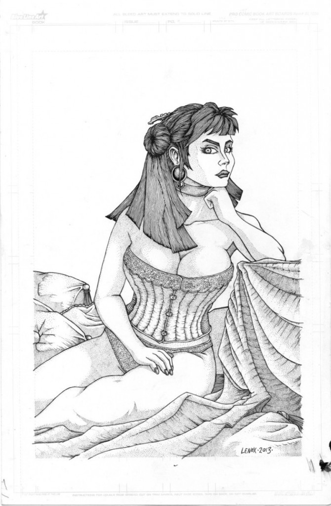
Painted Ladies of San Quentin- Alternate Cover- Final Inks
The final inked Jessica and last piece of the Painted Ladies 2012-2013 era.
Points of interest- the corset and lace- wow, what a huge pain in the ass, and what a cool payoff, they look great. The pillows and sheets are my first foray into better cloth and clothing, I got a great book about rendering fabrics, so Ill try to keep putting that to good use!
Not much else to say, but enjoy that sexy pinup, my inner Joseph Linsner has been released! My 1992 hands pinup story has been exorcised (ask me if you dont know my Dawn fan art Convention Smack Down story as a 17 year old!!)
Speaking of fan art…. Look out for some awesome pinups coming your way soon!!
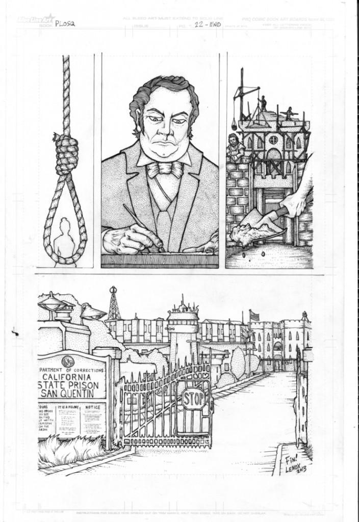
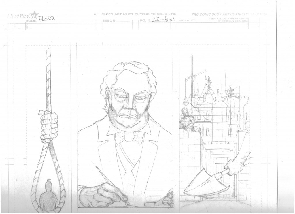
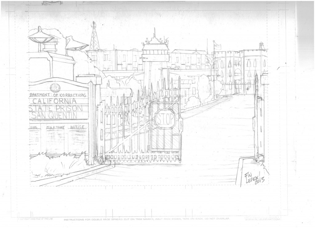
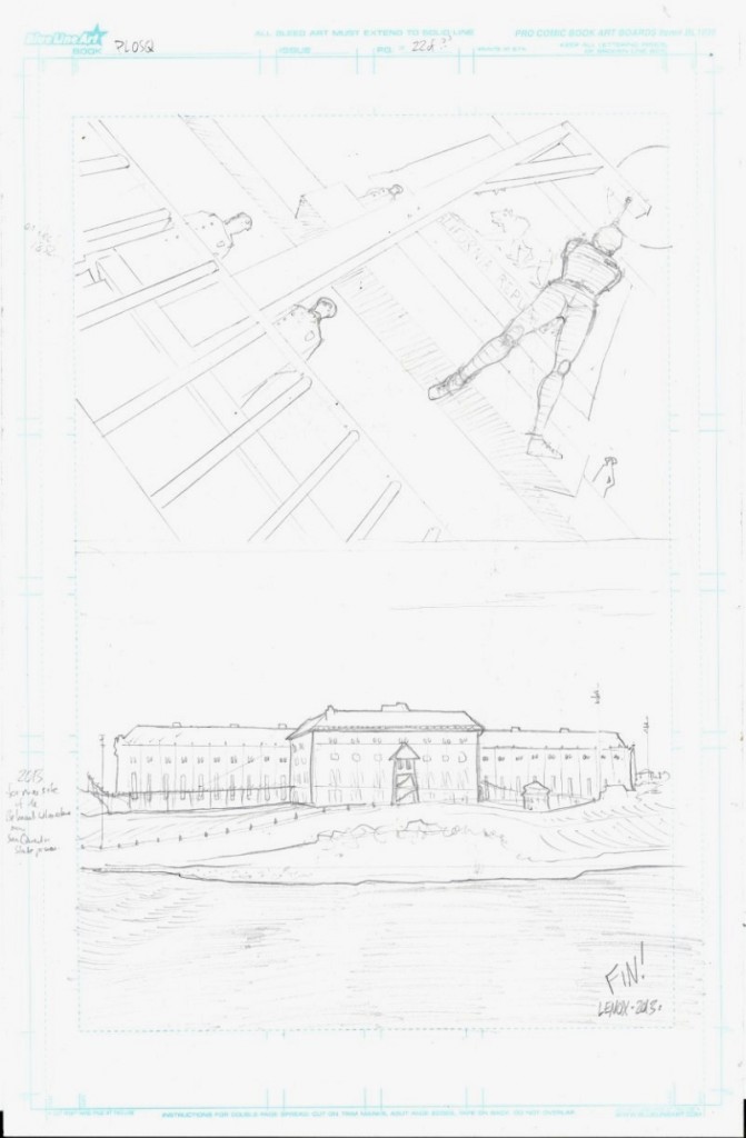
Painted Ladies of San Quentin; Page 22- Final Inks- FINAL PAGE & Two Versions!
The hangman’s noose ominously over the head of Jessica Belmont before her execution in 1852… Governor John Bigler later signs over the land the murders were committed over… later in 1852 constructions begins and then ends in 1854 on a new state sponsored construction project… THE SAN QUENTIN STATE PRISON- California’s oldest State Prison- which stands til this day in 2013- hello historical fiction at it’s finest and most violent- thanks to Boardwalk Empire and Gangs of New York for the inspiration for this tale of what MIGHT have been the true story of the San Quentin Prison’s murky origins! Thanks to Elijah Holman, Jessica Belmont, The Chinaman- Xi Chou Long, El Alacran & Company and Sheriff Clyde for being such fun characters to, well… kill off violently!
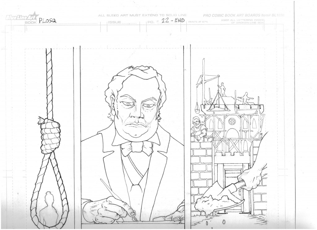
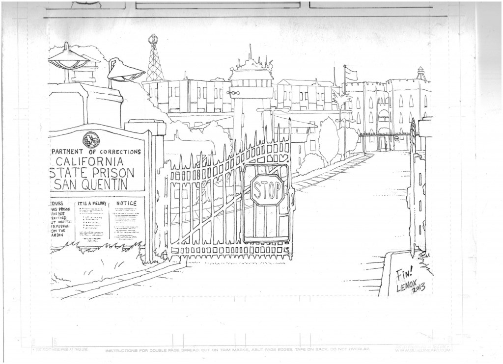
From a layout standpoint, this page was totally changed from pencils #1 at the bottom that I made in January into a totally new page pencils #2. Superstar Artist Tommy Castillo commented to me a critique I asked for at Philadelphia Wizard World a few weeks ago that the hanging was too super-hero-ish. This combined with a comment from another friend about “Where are the crooked politicians?” led to a new layout- less superhero hanging, more ALFRED HITCHCOCK suggested violence without showing so much in panel #1…. The third Governor of California JOHN BIGLER makes his first comic book appearance ever (as near as I can tell) …then I went to prison construction mode (with prisoners working like in the history books!) in the new panel #3. I end with the modern prison shot in panel #4…now from the land side in version #2, not the water side like in version #1- since we never really address or look at that water/peninsula geography in the whole comic- so why now? Exactly! So that is a totally different shot of the jail, and that is the new and revised page 22 version #2!
This comic wasn’t going down easy at the end was it? The last page took the longest and had two different versions, so if you have been following my posts, none of this is a surprise!
From a technical standpoint, this was a nice portrait of Gov. Bigler signing a paper, a study in rope and two very annoying architectural renderings, so the page was less organic than the rest of the story, but very hard to pull off nonetheless. Panel three looks like an old testament bible engraving, and I hated doing that panel, but it really worked in the end so I am glad I suffered through it. I did less inking in the final modern page so Joe Freistuhler had more freedom to run with his only modern colored panel to pull a “Wizard of Oz” and go from sepia to full color at the last minute to show the “modern world” of 2013.
As usual- I’ve included the pencils, line work and final inked rendered page for review and analysis below.
ON A FINAL NOTE…..
The project on my end is done, all 22 pages for a full length comic with a wrap around 2 page cover! I cant believe I’ve been drawing this for over a year now, the end of a mini era for me! Personally, this comic stands as my PhD Thesis in comics creation, but of course, I want to keep getting better. Ill be taking a break from sequentials for a bit to do some pinups and freelance work, but of course, I’ll be back at it before you know it doing something totally different, and no doubt better than this project as I have learned SO MUCH from this process- from storytelling, to anatomy to general art skills! Thanks to everyone who made this project possible- especially my wife Crystal Lenox and Son, Blaine Lenox, who let me have the time I needed to complete all of this work!
Thanks, and I hope everyone checks this story out when it is 100% done and included in my next anthology- UGLI STUDIOS PRESENTS #2 later this summer!
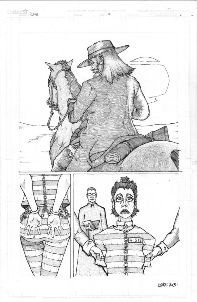
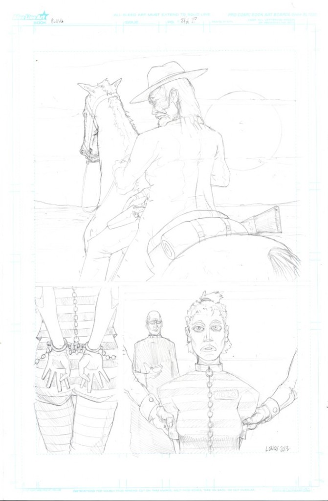
Painted Ladies of San Quentin; Page 21- Final Inks
The classic “Hero riding off into the sunset” marks the last image I’m doing of Elijah Holman for this story- great character, fun story arc. I’ll miss the old white haired bastard with his long beard and two six guns as he leaves us passing the Lord’s judgement on the Villain, Jessica Belmont, who with a tad of exposition we show her in chains with her hair cut short looking up at the hangman’s noose that meets her on the final page after this penultimate group of images!
From a layout standpoint, this really ends up being a farewell pinup at the top of the page leading into two images at the bottom moving the story into the final phase of ending the narrative. At the same time it leads into killing the last living villain before the reveal of San Quentin Prison at the very end, it’s simple and powerful, and the image of Elijah seems very “Old Testament” in my opinion. There isn’t a huge “explosion” with this guy at the end, and the artwork conveys that calm sense of his being and how he chooses to end the conflict that has engulfed him and his town in a non tradition “action hero” way.
From a technical standpoint, big alterations on the horse and Elijah’s anatomy from the pencils- see the changes? And lot of tweaks on Jessica in the final two panels- from the butt and chains to the hands and especially her eyes… now they are looking up- foreshadowing a noose!. I was happy with the back lighting on the top panel with the contours on his clothing and stippling on the horse, and really pleased with the shading on Elijah’s face. The striped prison jumpsuit looks cool too, in my opinion, from the stippling.
On one minor note, I made her prisoner # on her shirt my Son Blaine’s birthday, so there you go little dude, an Easter Egg for you!
As usual- I’ve included the pencils, line work and final inked rendered page for review and analysis below.
One more page to wrap- lets get it done!
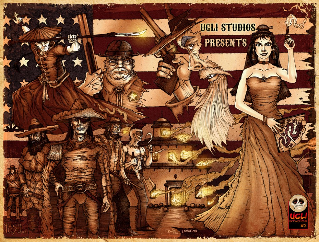
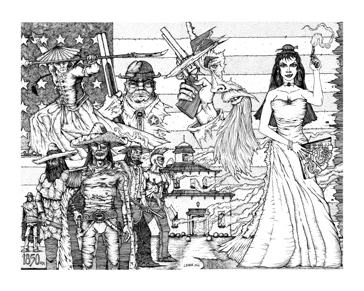
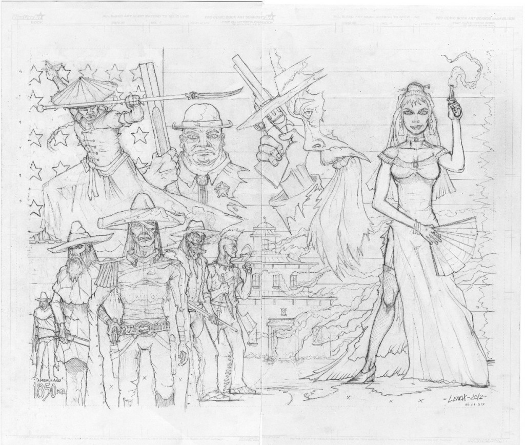
Wrap Around Cover Art: “Painted Ladies of San Quentin” – Final Colors
As we hit the home stretch of completing my “Painted Ladies of San Quentin” project, and with it, my second anthology book- “UGLI Studios Presents #2” with Brian Allen, and Joe Freistuhler, this completed wrap around colored cover just came in from Brian, who did an amazing job.
First of all, Im lucky to know this guy for two big reasons.
#1- As a fan of his art, I’m blessed to have him work his magic on my pen and inks- this piece has been waiting for color for almost a year now, and he knocked it out of the park with the antiqued look I asked him to achieve.
#2- Brian is a great friend and it has been great working with him on this anthology comic, while I’m excited to see it wrap up, I’ll miss the experience. I’ve learned alot from Brian about everything from the business of art, to the highs and lows of the convention world and lots of small tech tips from pens to networking. For all of that- I am eternally grateful as well!
So check out my pencils, inks and the final colors Brian Allen added on the wrap around cover part of this upcoming comic from UGLI STUDIOS!
And hit up Brian on facebook here and see what other wild stuff he is up to!
Painted Ladies of San Quentin; Page 20- Final Inks
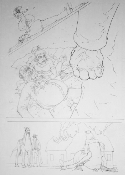
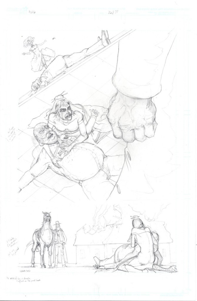
We see a broken Jessica Holman running to the Sheriff’s side- and she is devastated from the loss of her lover/co-conspirator. One of the things the reader can determine is the question of her emotional state- is it based on a real connection with the dying Sheriff, or a realization her plot has failed and she will be arrested or killed? And we see the judgement and mercy of Elijah Holman to walk away from killing a “defenseless” woman…
From a layout standpoint, overlapping elements again dominate the main panel with the huge hand of Elijah in the foreground, and the raw emotion Jessica shows next to a dying man… and the bottom panel, just conveys the death of the redeemed sheriff and Elijah follows the way of the lord- “love thy enemy” … this layout is still, on purpose, to convey a lack of action. Also I really worked to not add too much to the grass behind Jessica to let her figure dominate that space and to shade away from her, to highlight her emotion/face/rage/anger fill the reader as the POV comes from behind Elijah directed to her.
From a technical standpoint, move Jessica’s right hand to better effect below the Sheriff’s head, and really got more solid blacks and contouring into the mix to really keep that old school engraving look together, and build some drama with my use of lights and darks. Really pleased with the inks to build Jessica’s emotional face, and dress texture. Also note the stipling and heavy line work under the sheriff to have the blood pool overlaid with shadows to show he is a bit lifted up by Jessica’s hand. This was an added benefit of moving her hand- see the improvement from pencils to final inks on that one element. It really improved the figures. Also a slight change on the Sheriff’s right arm placement, and his left hand is now in a more natural position from the original pencils to the ink- these also really improved the page as well.
As usual- I’ve included the pencils, line work and final inked rendered page for review and analysis below. 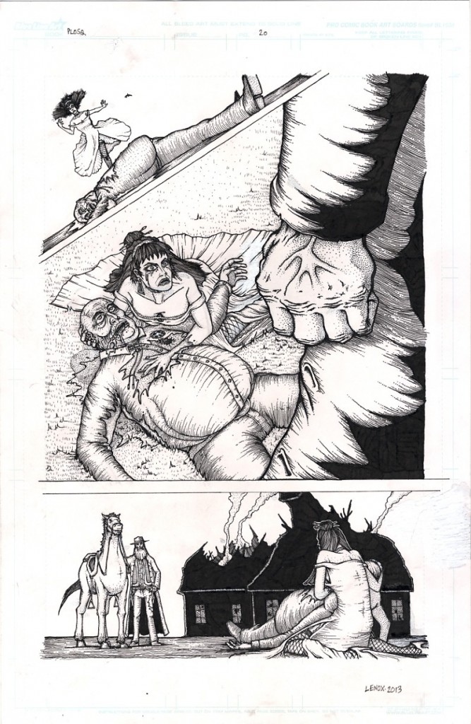
Painted Ladies of San Quentin; Page 19- Final Inks
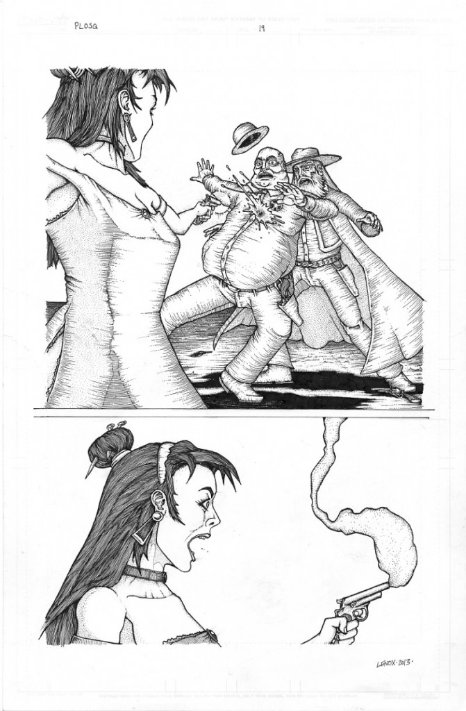
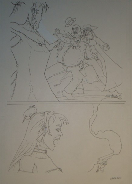
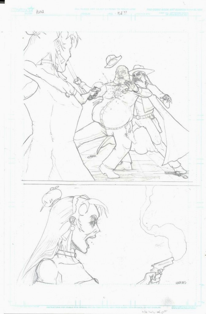
Jessica reveals that she is a stone cold killer, and makes her move to eliminate Elijah Holman once and for all, but one thing ruins her vicious strike.. the Sheriff has a conscience, and gets in the way of the bullet, saving Elijah at the price of his own life, but will it redeem the Sheriff’s soul? Jessica has a visceral reaction to her plans unraveling…
From a layout standpoint, overlapping elements of the three principal characters dominate the main panel, and tight and gorgeous profile of a screaming Jessica. I felt I really brought emotion to the four faces on the page.
From a technical standpoint, I used contouring to great effect with stippling as the choice of texture for flesh. Just falling in love with my insane textures for hair, it takes a long time, but you can’t help but get lost in the long odd textures of that black hair spilling down Jessica’s shoulders! The large change from pencils was the sheriff’s right arm placement- the gun that led into Jessica’s face was a tangent causing nightmare- so it had to go, I was pleased with the new arm/hand and lack of rifle.
For me this page was another tough challenge- it seems like the closer I get to the end the harder each step takes- I’m going to do whatever it takes to get this monster under control and finish strong!! I’ve included the pencils, line work and final inked rendered page for review and analysis below.
Social Media
Categories
- 30 Years Later
- Advanced Fighting Fantasy
- Book Cover Project
- Captain Anarchy
- Colored Work
- Commissions
- Dr. Who
- Figure Drawing
- FUBAR
- Gathering Anthology
- H.P. Lovecraft
- Hiatus
- Jason in the News
- Kantara
- Logos/Promotional Work
- Lords of the Cosmos
- Masters of the Universe
- Miscellaneous
- Music
- Mythological Creatures
- Painted Ladies of San Quentin
- Pen & Ink
- Pencil Work
- Role Playing Games
- Satanic Artwork
- Sequential Work
- Tattoos
- Tee Shirt & Fashion Art
- The Great Vermin
- Through the Eyes of Grizelda
- TPK Games
- UGLI studios
- Viper Comics
- What's New
- Zero Charisma
Pages
Cool people Jason works with
Jason Lenox Conventions
Jason Lenox's Retailers
Lenox's Recommended Links
More about Jason Lenox

