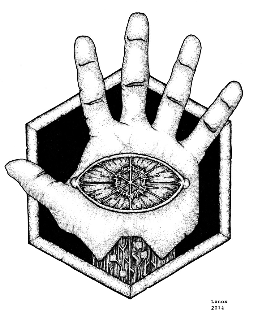
Extreme contrasts from black to white really made this insignia stand out. The plain flesh of the hand with the obsidian background are offset by the high contrast micro details in the circuit wrist and electrical eye. I really think when this graphic is plugged into some characters costumes it will all come together as I am laying the graphic arts groundwork on the new “LORDS OF THE COSMOS” Project with the most basic of components- the logos for our villains, and next the heroes!
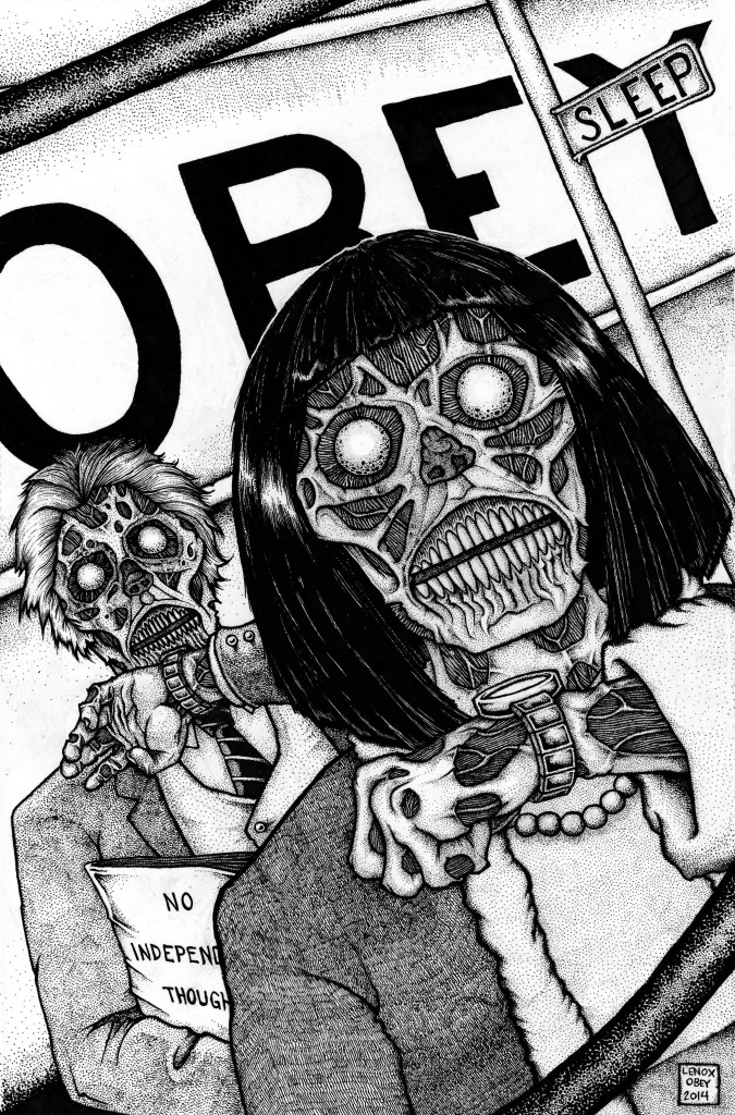
THEY LIVE Pinup – Final Inks
This piece seemed like it took FOREVER, and yeah back to work, family, home shows for my regular job, comic shows etc. etc. all got in the way. However the end result turned out to be, well outstanding. Yes I called my own work outstanding, because I really like this piece.
Took the CONFORM sign out, it started to make a tangent, really worked the crazy textures on the ghoul’s skin and veins, and just really took my time to deliver the artwork that I wanted to see from this classic movie.
Not much else to say except…
“I’ve got one that can see….
He’s a tall, Caucasian male….
Unarmed, wearing sunglasses….”
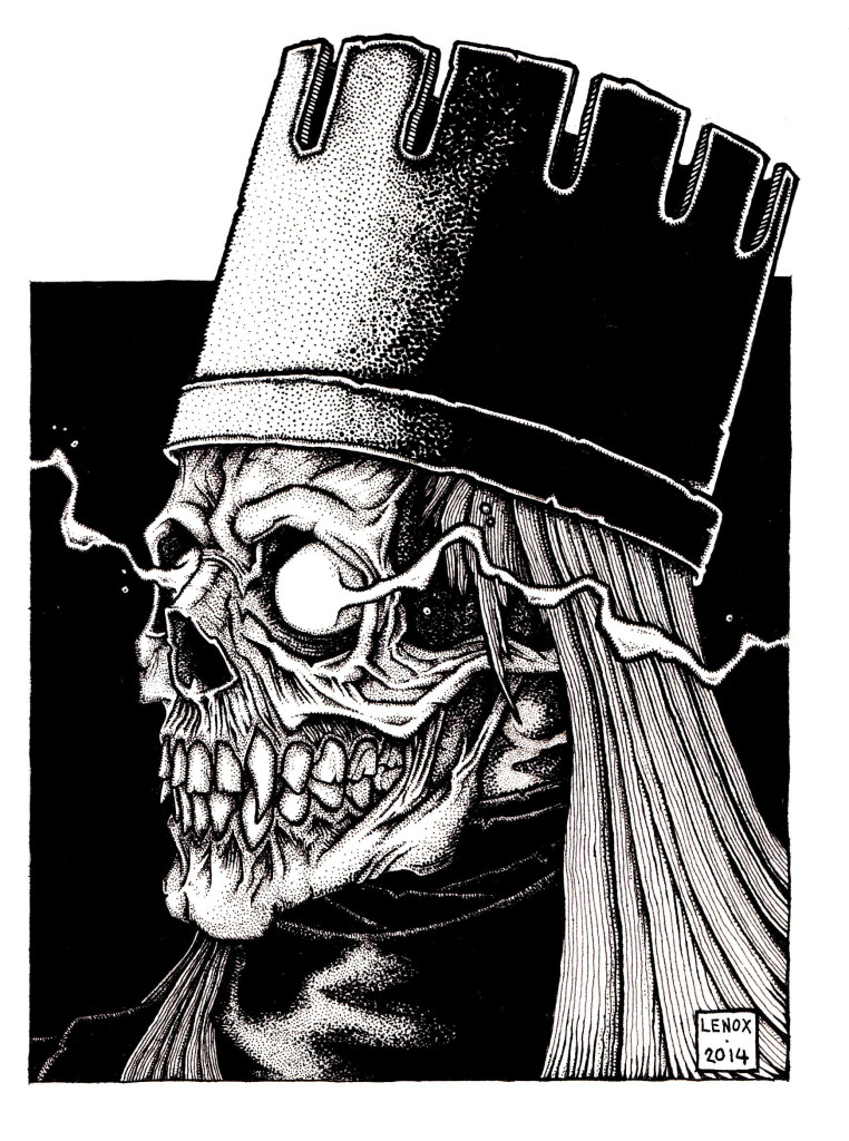
Vampire Lich King – Final Inks
I think the inks just killed it here with the large black negative spaces contrasted against the white energy coming out of the eyesockets. The skull texture and hair parallel contoured lines really sell the viewer on the image as having weight and depth- this turned out so old school Dungeons and Dragons, I’m ready to roll that D20 now!
Enjoy!
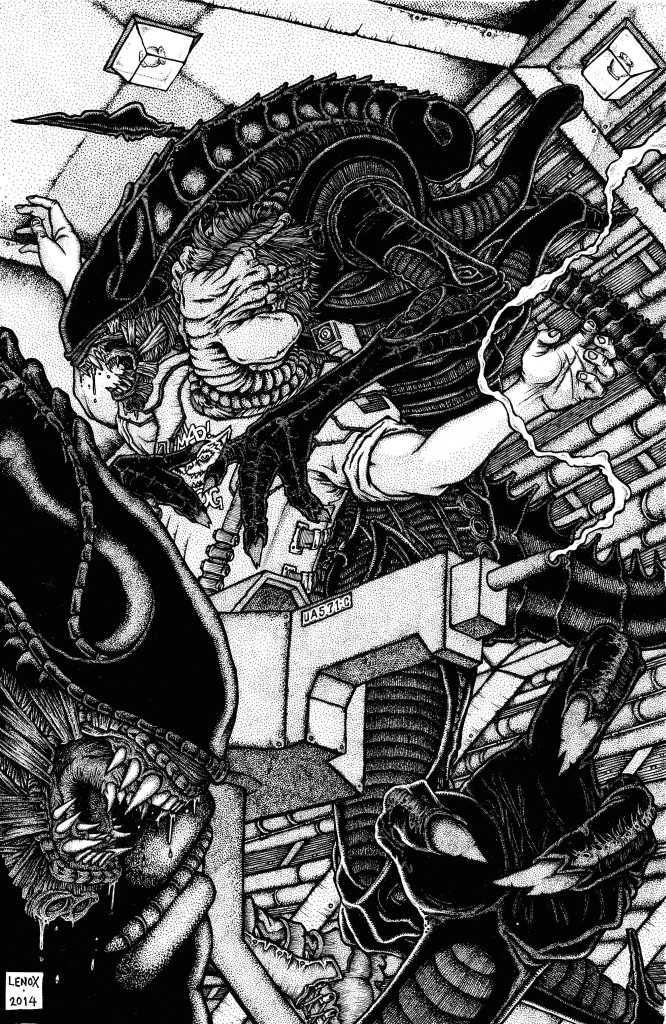
Aliens: Overrun Colonial Marine Checkpoint Pinup – Final Inks
So the Aliens/Colonial Marine project comes to a close- and I think I threw out my ALIENS rants and raves in my pencil post here, so I’ll focus on what challenges the inks brought me as I brought this piece to completion this week.
#1- I had to correct the 2 pt perspective on the UA571-C gun and 1 pt on the hallway in relationship to the hexagonal wall system, it was incorrect in the pencil stage.
#2- The Aliens “Blackness” I had them too black and used some white paint to rebuild some contrasts in the overlapping black on black areas. Then inked over them to bring them back to a more stippled gradation to match the rest of the inked rendering. The Aliens are dark creatures in dark spaces, so it was a tight balance to bring to a proper level with the Aliens unique look and style in a low lighting environment.
#3- The spinning emergency lights (in every Aliens film) they were a bugger to get “right” in the inking process.
#4- the pipes and wires in the background- ugh, so cool to see, but so annoying to do!
Overall, I think this artwork ended up being the Aliens artwork that I wanted to see, and I have not encountered as an Aliens fan. I geeked out on the final product, which is just a fun place to be as a creator and fan simultaneously to generate the content you want to see. I look forward to seeing the response from others as this piece gets out to the public.
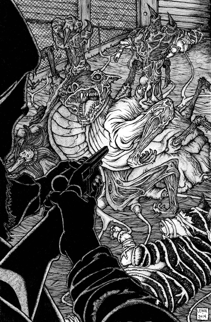
THE THING 1982 : Dog-Thing Pinup – Final Inks
I was very pleased with what the inks did to this piece- from the striking use of black to silhouette out Kurt Russell’s character “MacReady” in the foreground to the background textures of the wood walls and hay on the floor that all outline “THE THING”. I made it a point to work to keep all of the objects in totally different inking styles so whether this piece was black and white, or in color it still strikes you with all the different materials and lighting. Speaking of light- I was also happy with how I used a compass to make bigger circles emanating from the central light source to use different levels of line work and stippling to show the flashlight as a light source. The heavy line work on the large hands from the THING and the dogs that are being absorbed also gave all of the primary objects a real 3-D feel that you can almost reach in and feel the textures unfolding at the scene. Finally, I felt that the THING’s dog-face was an awesome focal point with the chiaroscuro really bringing out the melted and malformed features on the dogs unbalanced and angry face.
The awesome employee at JARU Inc. that does my large scale scanning, Miss Megan, who scanned this today, told me the image was upsetting and made her uncomfortable- all I can say is- Mission Accomplished!
Another Killer pinup under my belt and onto the next one-hope you enjoy this one as much as I did making it!
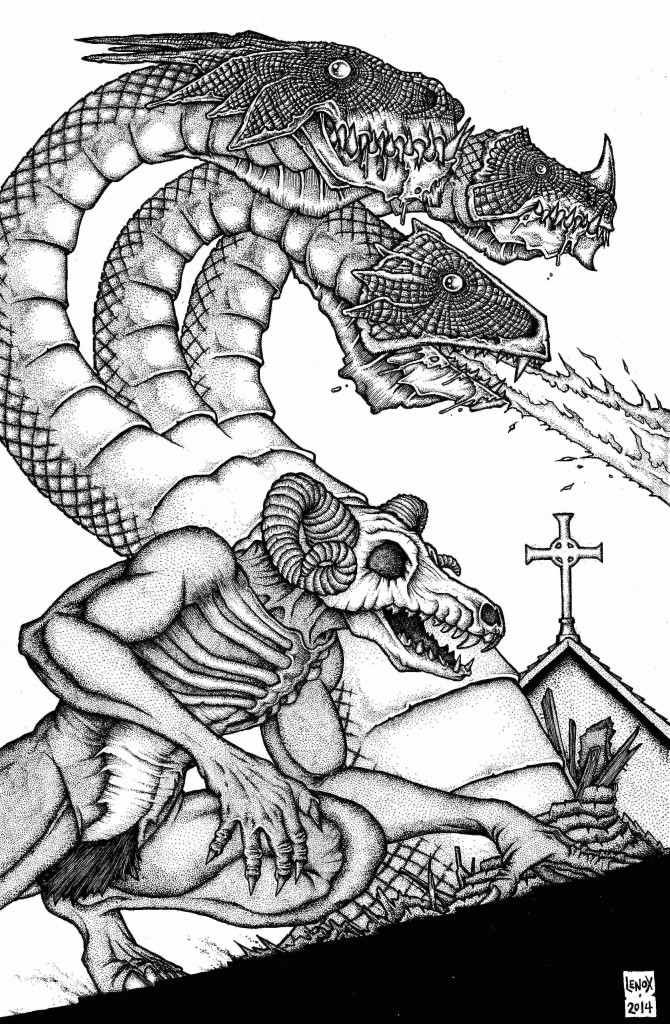
Barron the Demon and Hydra Pinup- Final Inks
Here is the final inked version of this pinup- the biggest insight I can give is there was an old fake leather product my Grandmother had on a purse that I didn’t care for- it looked and felt weird- so I tried to mimic that on the Hydra’s heads for an otherworldly texture that also offset the lifeless eyes. I also gave Barron’s skull head a tweak to make it more 3 dimensional- it seemed off in the pencils with the head more a straight profile and the jaw on an angle- so I balanced it out. His right hand was altered as well in the inking phase to make it more realistic as well as creepy, It seemed to go from a weak element in the pencils to a strong one in the ink phase. Enjoy – and check out Joe’s book here– it got funded at over 100%
Really pleased and proud of how this turned out, and another Lenox Dragon is always a good thing to see…. Enjoy!
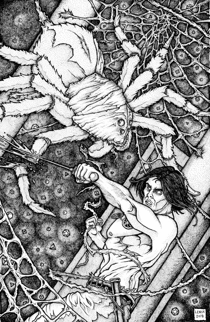
Conan and the Tower of the Elephant Pinup- Final Inks
These are the final inks for my Conan pinup based off the Robert E. Howard short story- THE TOWER OF THE ELEPHANT.
I think the inks really brought out the magic tower element with the crystal walls and embedded gems. Overall the inks really made this piece pop, the Spider and Conan elements ended up being the lighter elements on top of the intricate background.
I think I succeeded in making a high quality Conan piece, accurate to the book, and also was a unique take on the subject.
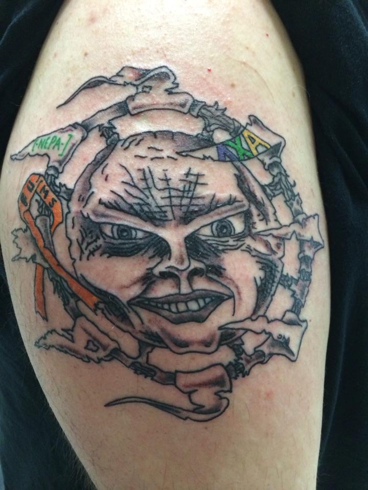
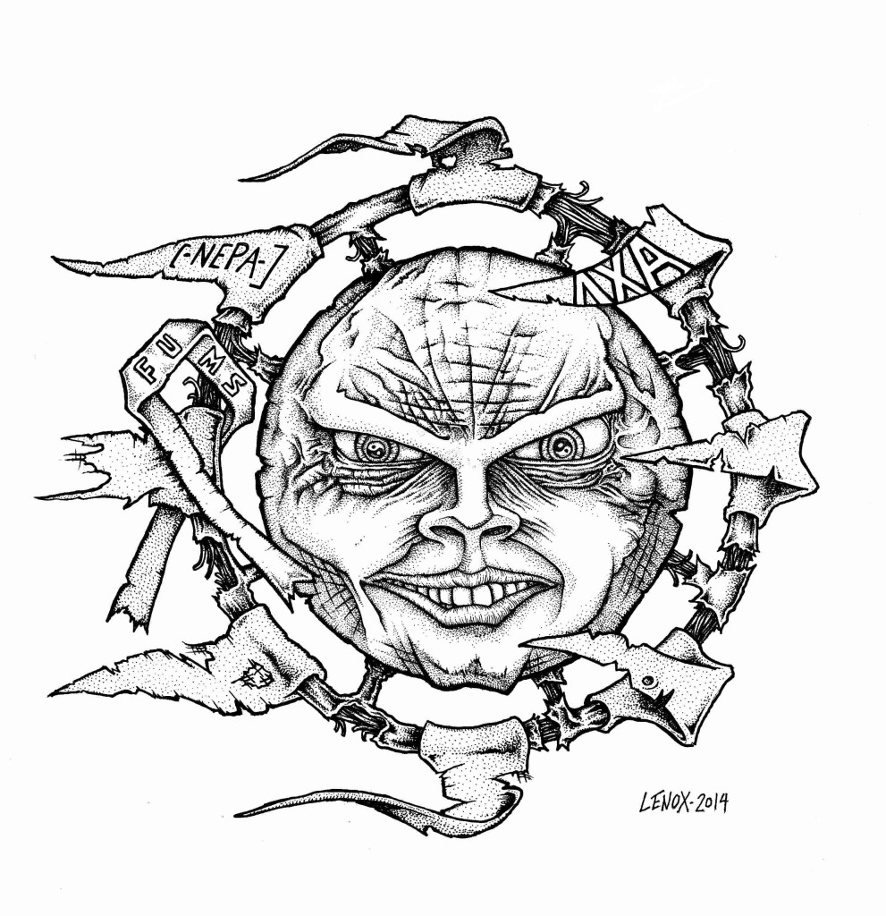
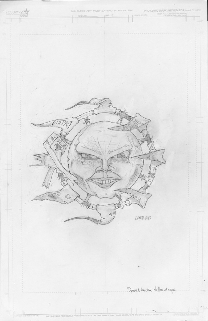
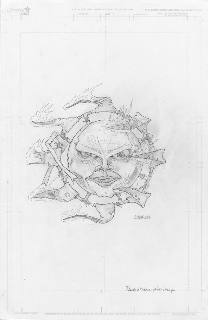
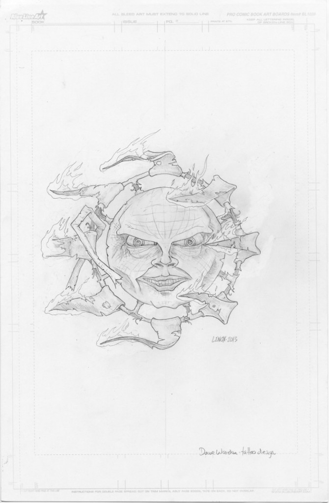
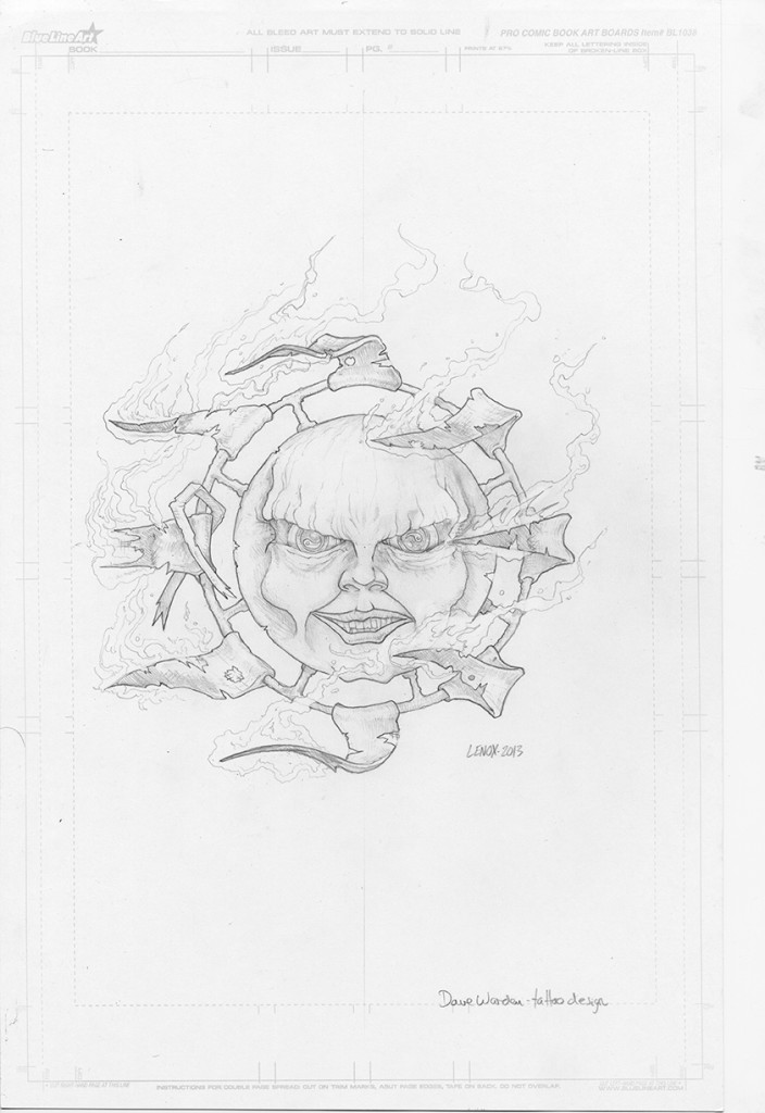
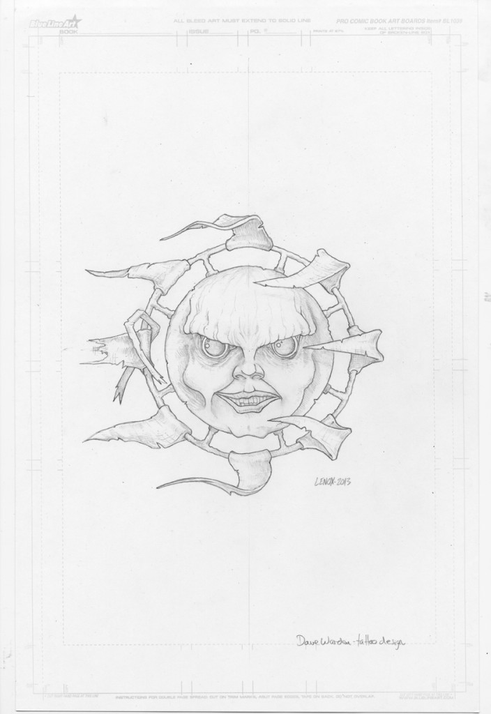
Broken Sun Tattoo Design
O.K… so this is something I get asked about frequently, and yes I do it when it makes sense… “Do you design tattoos?”… This is always a rough and slow process as the goal is to pull something out of someone’s head that isn’t necessarily an artist, but can “see” something, and like blind man’s bluff you are shooting darts to hit that imaginary target.
So this project was for a friend and fraternity brother, Dave Warden. A few words on Dave- I’ve Known Dave for about 20 years now, and he has always been a great older brother for me- sometimes we have spoken and seen each other frequently, and sometimes not so much. Also Dave has always been someone that would equally tell me I was wrong, as well as praising me when I was doing something right. I can also thank Dave for about 50% of my technology knowledge, also introducing me to the Geto Boys (2000?) and South Park (1997?) as well as many beers, laughs and good times. Pretty much, if you know someone like Dave, or as we called him “Sweet Daddy” consider yourself lucky, they don’t come along very often. Dave was diagnosed with M.S. a few years ago, which was a real blow to me, since I have known Dave so long I hated to hear that he would not have the same quality of life moving forward, and I realized we were all getting old.
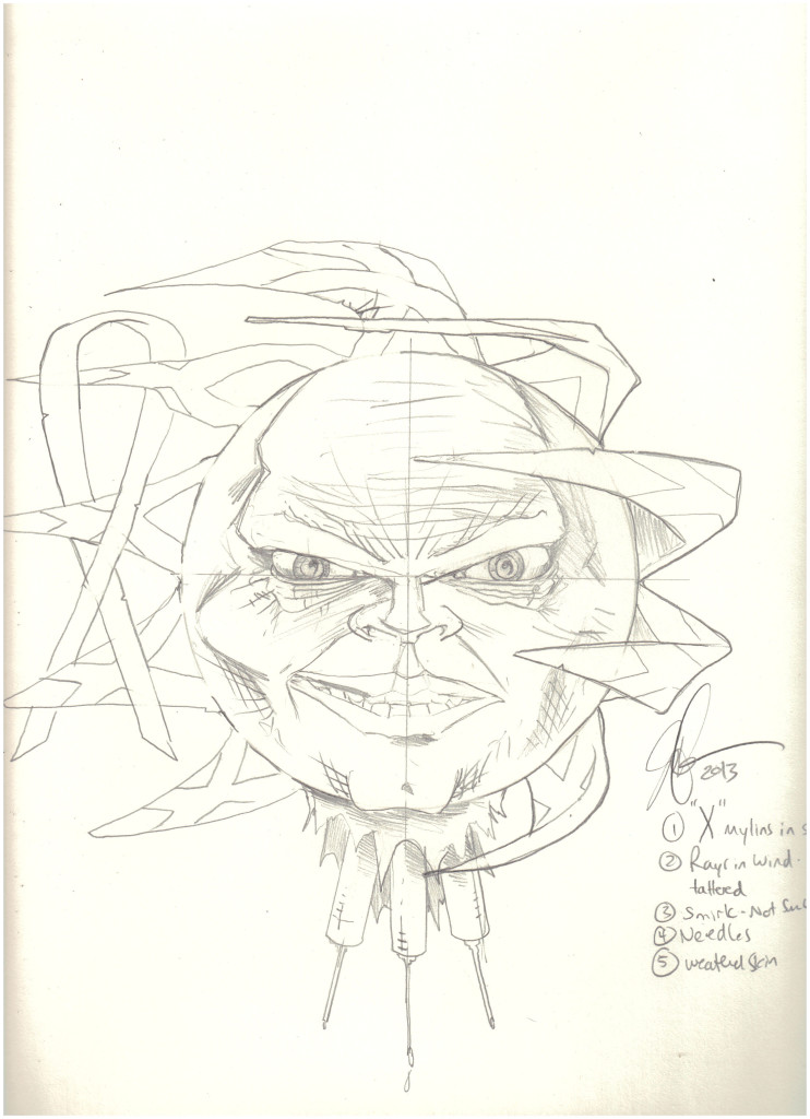
Anyway Dave contacted me about this project because he wanted to get a tattoo to show his dedication to fighting this disease. Dave has always been a supporter & fan of my artwork since about 1993. Dave actually made a Mad Magazine style cameo in this 90’s fraternity tee shirt I illustrated here – Dave is driving the golf cart. After our initial conversation about this project I got a real feeling that my return to artwork the last few years really made Dave proud of me, and I also got a true sense of his enjoyment watching me make so many new pieces and getting back to the younger artist’s dedication that he remembered before I stopped drawing which I reference in this post called “Hiatus”. I get so much energy from positive talks like this, so once I had an idea of what Dave wanted last Fall- “A Broken Sun with a Smirking Face Surrounded by Tattered Flags”- it was time to get to work and get this taken care of for Sweet Daddy.
One of the things I found as I researched this issue (doing my homework) was that alot of people in the M.S. community get tattoos, and what a rough disease this is to have. Losing control of my body has to be one of things that scares me more than most- other things being Sharks and Drowning that would rate in that category. So while doing this project, I gained a healthy respect for Dave’s situation and the M.S. Community in general, and I knew that I needed to give the project the slow process and attention to detail it deserved so Dave’s wishes would be accurately drawn out for the tattoo artist to put this into his skin permanently. Of course, tattoo needles and needles in general scare me, so yes I am a huge pussy.
Luckily- Dave loved the first draft, and there was a move to get more to the original sketch, which you can see I was already moving away in images 2-3! The 7 images below chronicle the journey from step one- to final inks. Along the way we had some adds, deletes and some happy accidents that Dave loved that I had no idea were in there- so that was awesome. When I do something like this, I abdicate about 80% creative control to the client, so it is a slow process. I don’t always agree with what we (Jason and Art Client) are doing in a process like this, but unlike most of my projects I make I’m not the creative director.
Ultimately It is important that this is what the client is comfortable wearing on their skin, so they are the boss. I can say that getting Dave’s final email simply commenting “Beautiful” made my day, another job well done with some killer artwork. Thank you Sweet Daddy, keep up the good fight!
Updated (2/9/14 with actual tattoo art on skin)
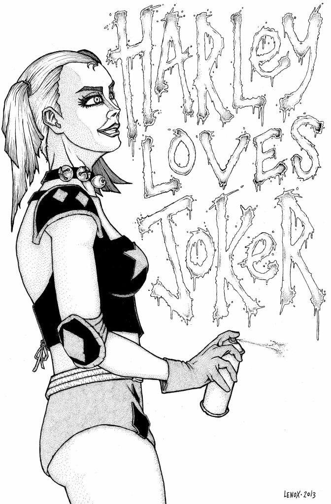
Harley Quinn Commission- Final Inks
The final inks to HARLEY LOVES JOKER
Notes- I really rebuild the face to get more of a sexy look and a pronounced nose, this worked well in my opinion – I also really felt the line weight and solid blacks evoked a style that I love from the old U.K. 2000 A.D. Books from the early 80’s. If you are familiar with that- chime in to give your opinion!
I also changed up the Heart’s in the middle and just made it say LOVES- it was unclear to the public what I was trying to get accross- so it had to change!
Overall, I felt a solid composition and execution on a fun commission for a client!
Social Media
Categories
- 30 Years Later
- Advanced Fighting Fantasy
- Book Cover Project
- Captain Anarchy
- Colored Work
- Commissions
- Dr. Who
- Figure Drawing
- FUBAR
- Gathering Anthology
- H.P. Lovecraft
- Hiatus
- Jason in the News
- Kantara
- Logos/Promotional Work
- Lords of the Cosmos
- Masters of the Universe
- Miscellaneous
- Music
- Mythological Creatures
- Painted Ladies of San Quentin
- Pen & Ink
- Pencil Work
- Role Playing Games
- Satanic Artwork
- Sequential Work
- Tattoos
- Tee Shirt & Fashion Art
- The Great Vermin
- Through the Eyes of Grizelda
- TPK Games
- UGLI studios
- Viper Comics
- What's New
- Zero Charisma
Pages
Cool people Jason works with
Jason Lenox Conventions
Jason Lenox's Retailers
Lenox's Recommended Links
More about Jason Lenox

