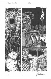
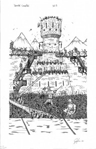
Category: UGLI studios

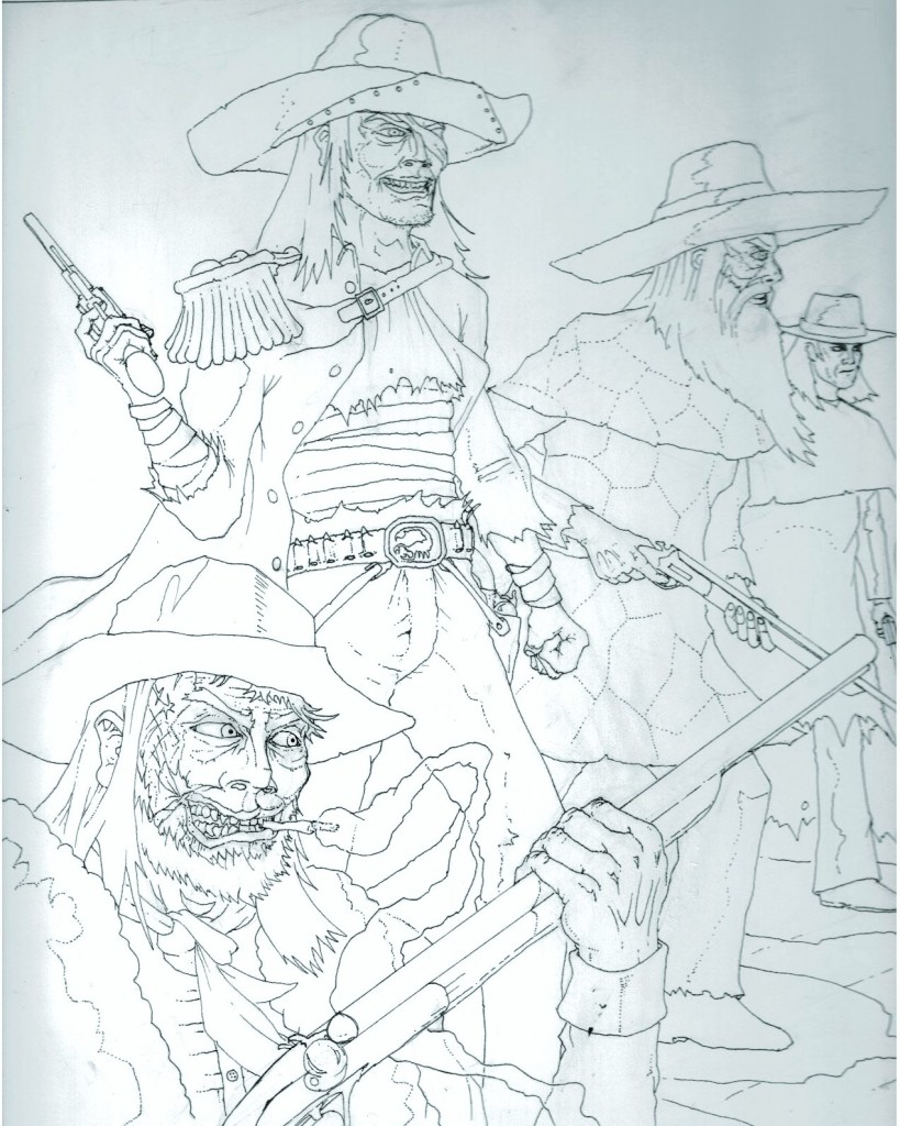
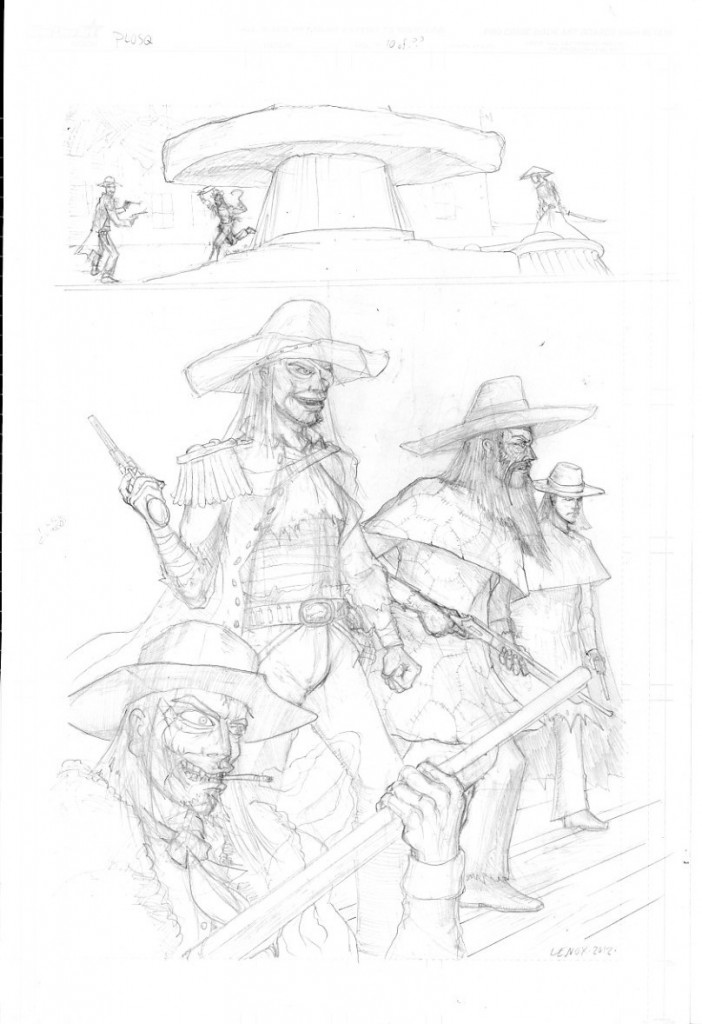
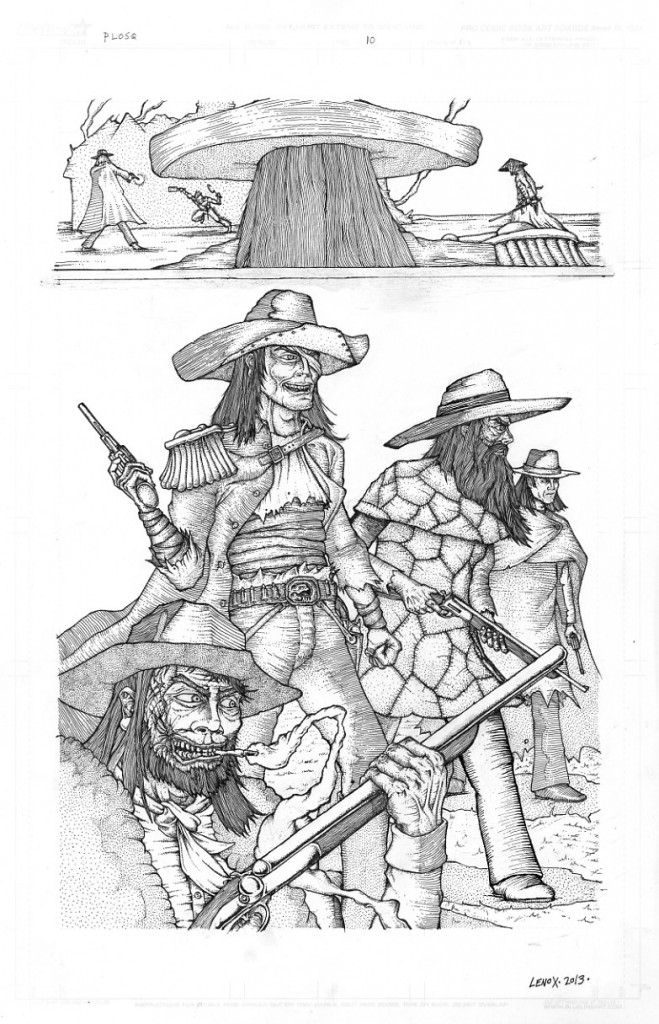
Painted Ladies of San Quentin; Page 10- Final Inks

This page had several challenges to bring it to inked completion.

#1- getting the space right- where is INJUN in realtionship to El Alacran, to Elijah to the Chinaman- the top panel lays that out well and then shows us El Alacran coming into the scene.

#2- Getting the El Alacran Gang done right- there are a slew of small changes from pencils to final inks, but it looks solid and kep tthe character designs and overall menacing look good witht he larger pinup panel at bottom.

#3- Inks- Lots of overlaying textures and shapes in the bottom panel- it was a tough row to hoe, but the overlapping elements work to build a 3-D space while not having any visual issues- primarily eliminating tangents- what is a tangent- well Ryan Pancoast gives a great explanation here

Overall-  I felt the inks worked with the pencils to keep the style theme and mood together, and the page also kept the story moving ahead-



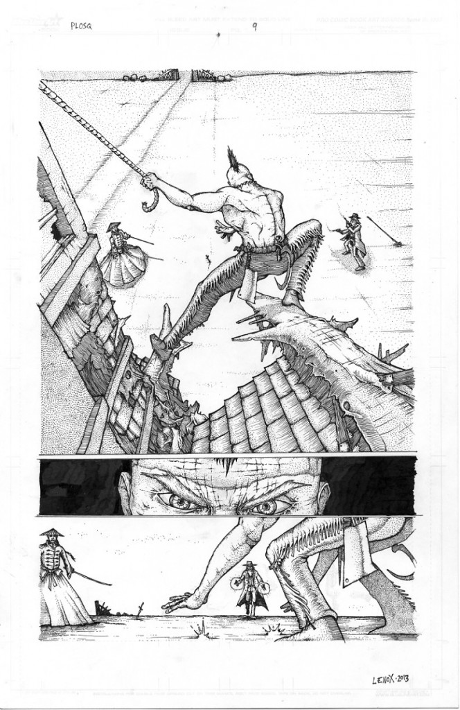
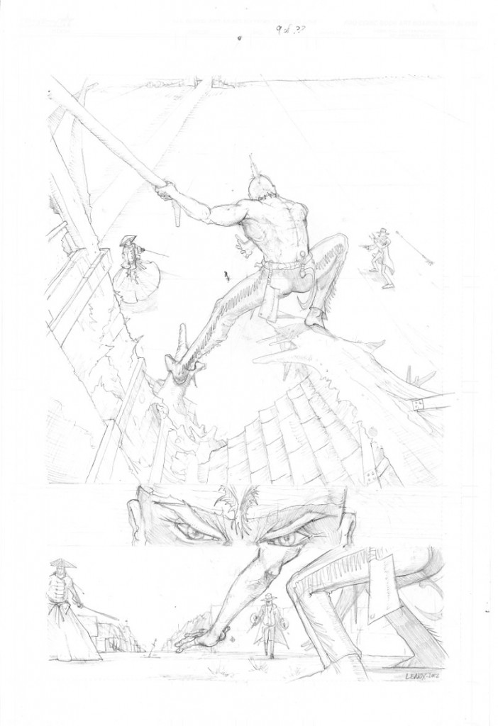
Painted Ladies of San Quentin; Page 9- Final Inks

Page 9 – 100% done and ready to color….

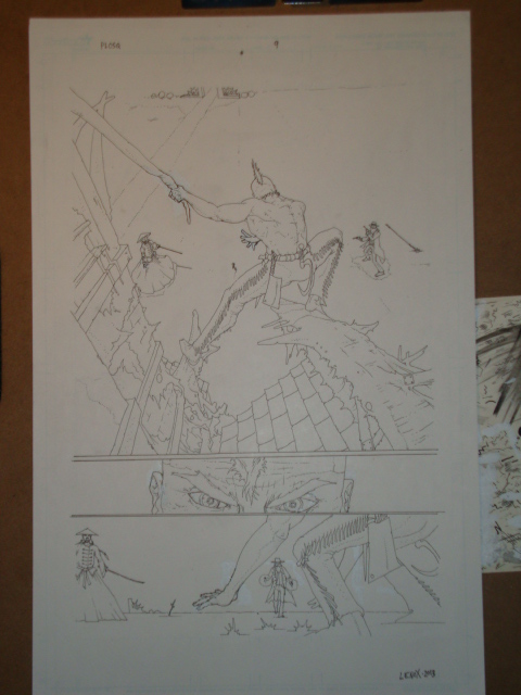
So another insanely complicated piece to ink fraught with tough spots – Injun’s left hand still haunts me… but the final product nailed it- from the characters far off in the background, the tough to ink tassel leather pants, the rubble on the demolished building, it all worked.  And we moved the story, added some tough and different angles, and went from closeups of Chinaman and Elijah to some wide angle shots- a really hard page, but it paid off artistically and in moving the story forward appropriately.  I changed the wood rubble to a rope in the final inks, thanks to Dave Sharpe for the push to do this- nice change, it works.

Included are pencils, and a middle ink, with only basic lines, no shading or rendering for comparison.


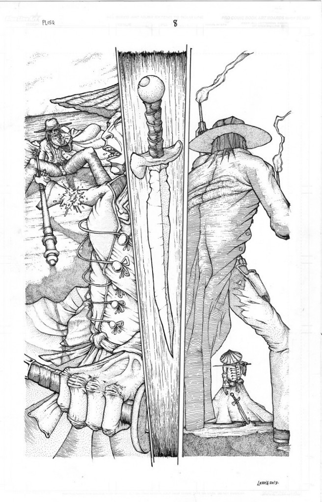
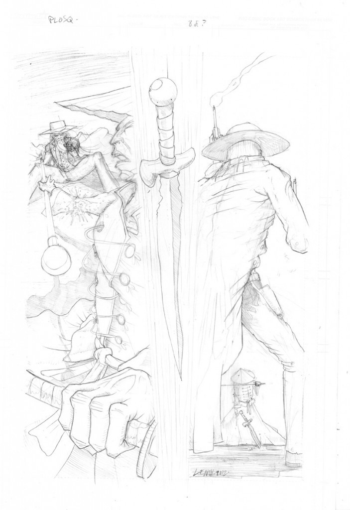
Painted Ladies of San Quentin; Page 8- Final Inks

Page 8 of PLOSQ- 100% inked and ready to go to color…

Still on a page a week schedule, and this page was ambitious, maybe one of my most ambitious pages yet- the angles, shading, stark changes in perspective, motion and close ups (really digging the fist and outfit of Chinaman in Panel #1!) really have this 3 panel set moving and pushing the action between Chinaman and Elijah, and introducing INJUN, my one man killing machine!  Enjoy the inks, and prior pencils and lets keep this story moving to completion!


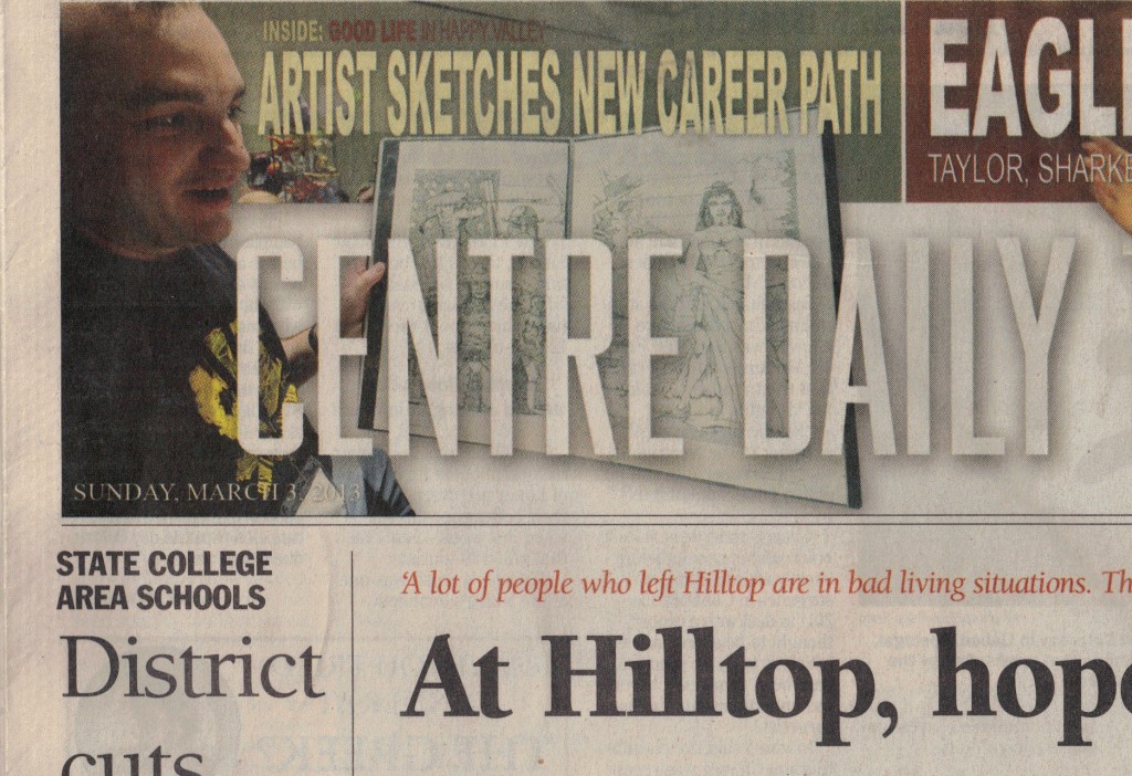
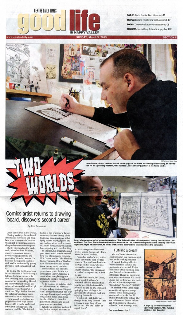
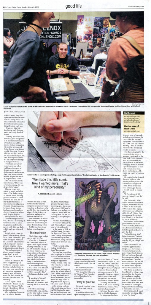
“TWO WORLDS” -March 2013; Centre Daily Times- Press Coverage and Feature Article about Jason Lenox

I was lucky enough to impress the Editors of our local paper in State College- the CENTRE DAILY TIMES in January at Setsucon when I met photographer Abby Drey (click on her name to go to her blog about our photo session). This  meeting led to a Feature Article in the 3/3/2013 Sunday CDT.  The reporter- Chris Rosenblum- really did a great job capturing my story in his feature piece “TWO WORLDS”.  So please enjoy reading about my personal journey from hothead kid, to a long hiatus to getting back at it 110% as the pen and ink wizard you know and love if you read my site!  Im hoping this leads to even more opportunities for my art in the future- some great stuff in here for Elaine Renna, Joseph Freistuhler and Ken Feduniwicz, and some great hype for Painted Ladies of San Quentin and USP #2 ! 

And as an extra bonus, there is a video of me here on the CDT site.


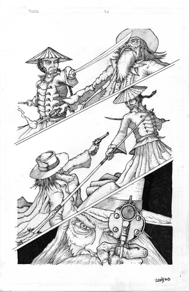
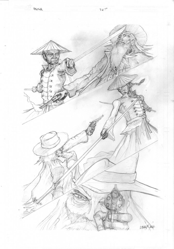
Painted Ladies of San Quentin; Page 7- Final Inks

Page 7 of 22 is now inked and in the can.  The big changes were in the bottom panel- altering the cowboy hat to the correct height, giving Elijah more “anger” in his eyes, and increasing the size of the gun/hand- all three edits really improved the dramatic impact of that panel as you can see from pencils to inks in the two images below.  Lots of linework to keep the old world feel in the textures of the inks as it relates to fabric, leather, metal etc.

Im realizing as I ink this story, that it is really intimate and alot of small interactions with some well fleshed out characters, and less “large scale” like last year’s “Through the Eyes of Grizelda” which had alot of crowds and masses of background characters.


Painted Ladies of San Quentin; Page 6- Final Inks

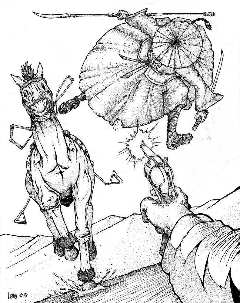
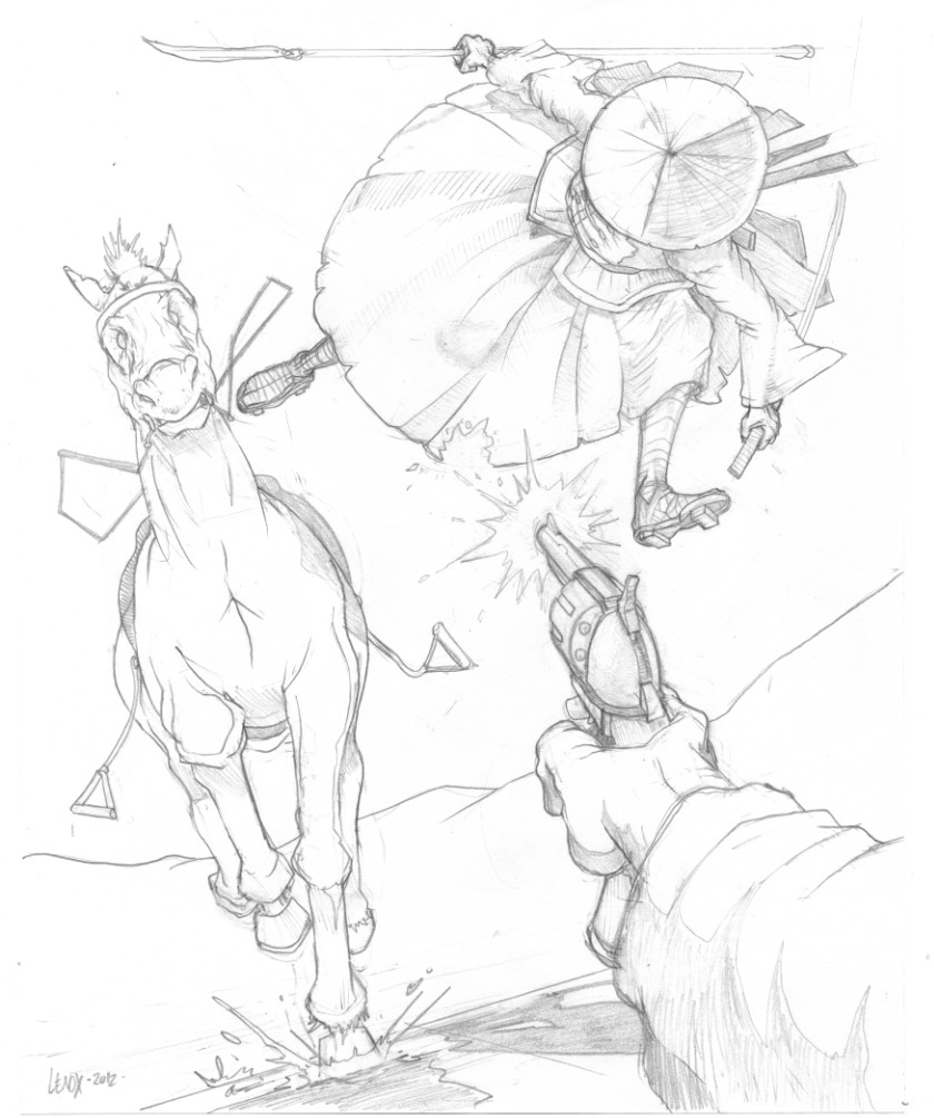
The action pinup page of “Painted Ladies of San Quentin” in full inks!

The big changes were the hand , and horse’s eye location (anatomy) and the gun (Technical Corrections).

The fun inking parts were the Chinaman’s textured clothing, and the close up cross hatching on Elijah’s arm as we get a POV of the Gunslinger in action for the first time.  The up close foreground cross hatching which was a fun effect I hadnt done before, and I will definitely use again!  The story here is in the action, or a picture is worth 1000 words!

And in this case, one big word- BANG! 


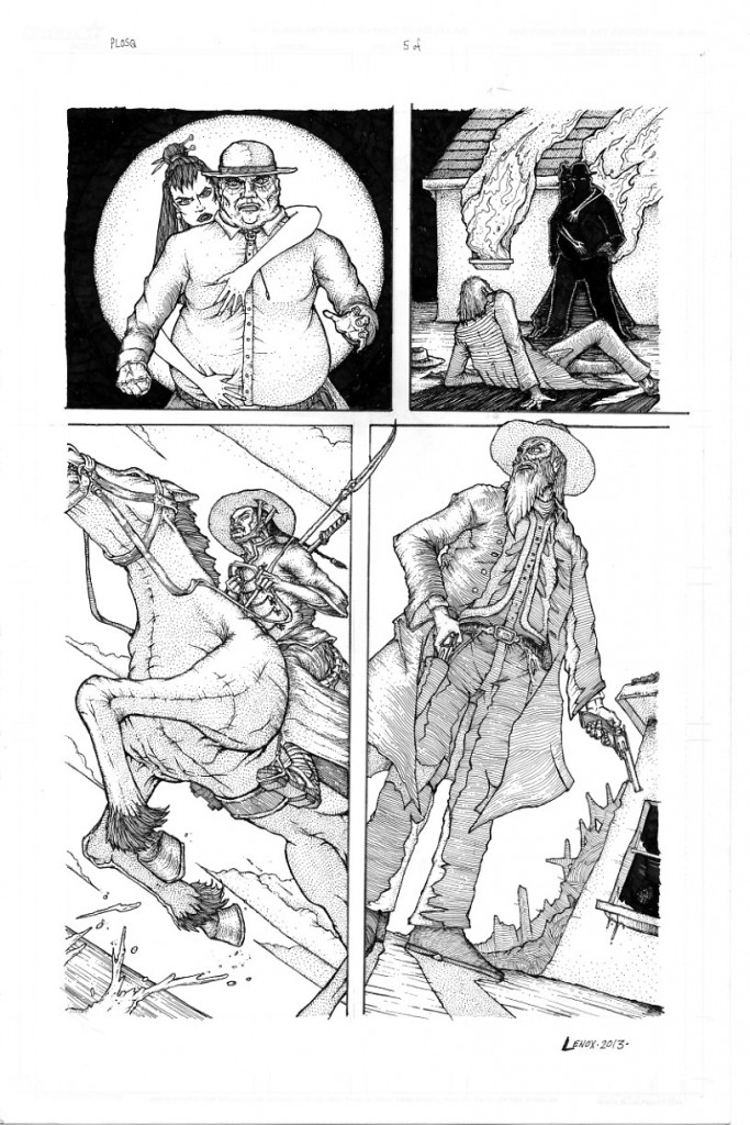
Painted Ladies of San Quentin; Page 5- Final Inks – with Changes on Panels 1 & 2

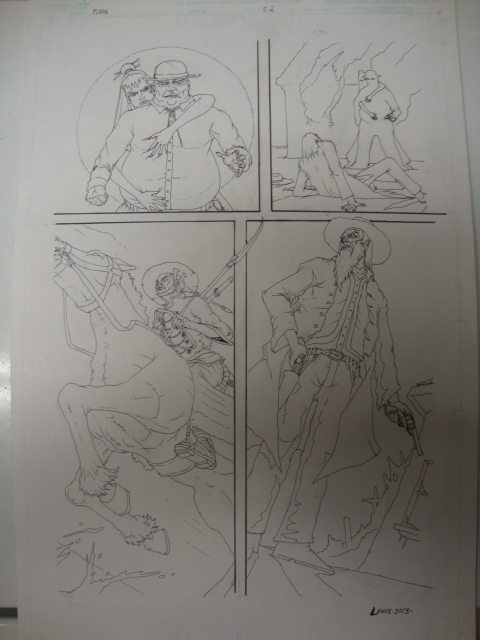
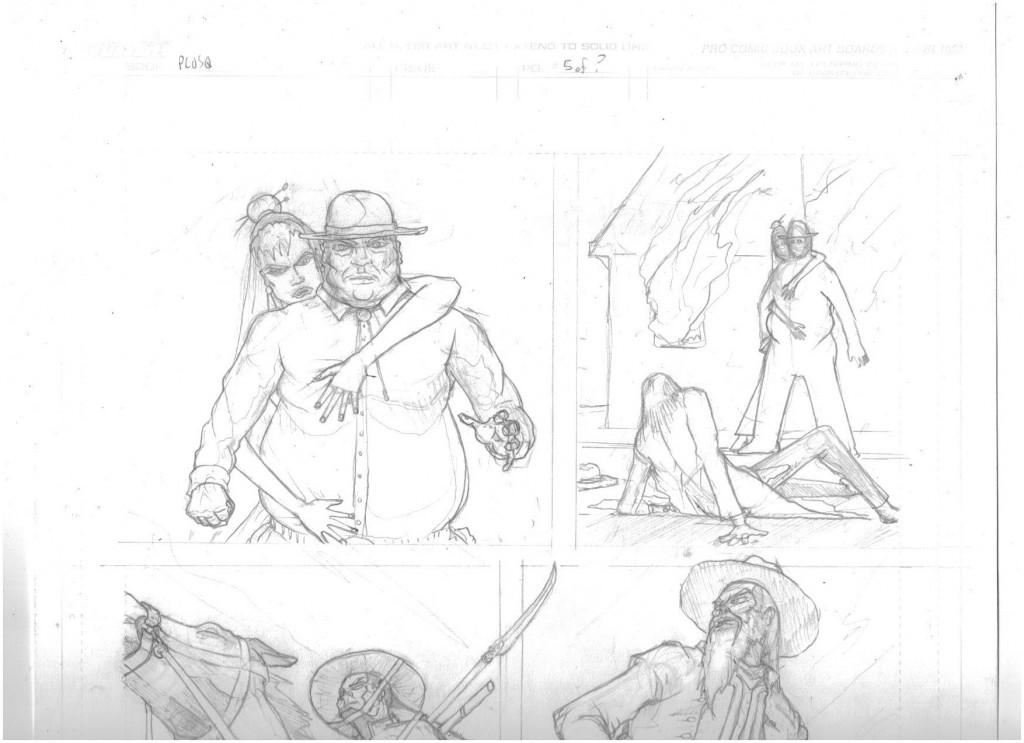
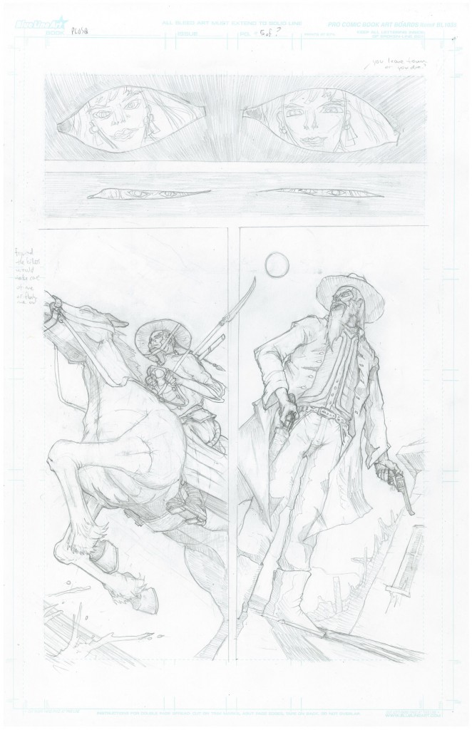
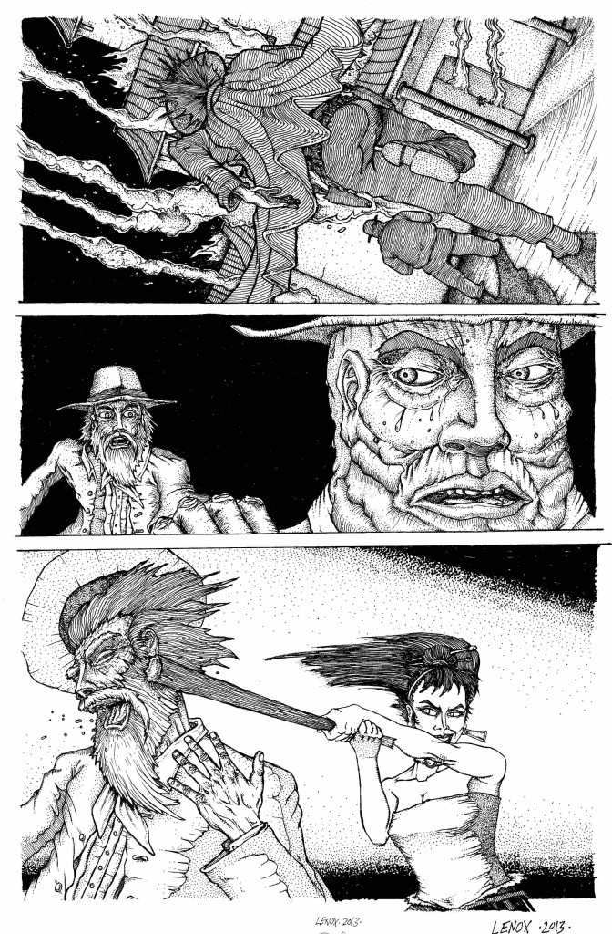
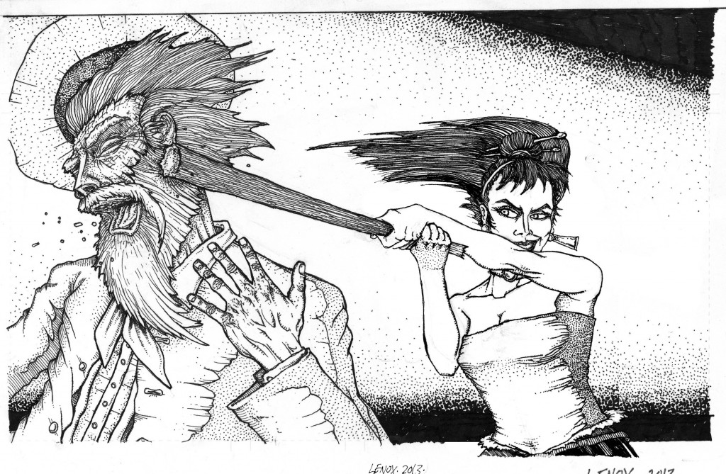
 Page 5 is now 100% inked- with changes on 2 of 4 of the panels.  Panels 1 & 2 were originally to close out the flashback by showing Elijah looking at Jessica while passing out- this received some fairly constant criticism as a storytelling device that didnt work.  Local author Abby Assetto pointed out that in the later parts of the story- we see an emotional response from Jessica about the Sheriff getting hurt/killed and that we never established a romantic emotional relationship with them, so I killed two birds with one stone- eliminating the two “eye closing” panels and adding two new ones to show a sexual relationship with Sheriff and Jessica, and also the type of relationship- combined with the hit to the head, and Elijah thinking Sheriff would help at the burning building he now sees that the power behind the Sheriff pulling his strings is Jessica… this is a mini-reveal, Elijah thought he was good- and symbolically, the hands are digging into him like a spider…. while also giving evidence of a physical intimate relationship.  It just worked- thanks Abby.  The last two panels had that great old time engraving look are a great segueway into page 6- the shooting pinup!

Below is the final page- the non shaded inks, the corrected pencilled panels and original pencils.


Painted Ladies of San Quentin; Page 4- Final Inks – with Repairs on Panel 3

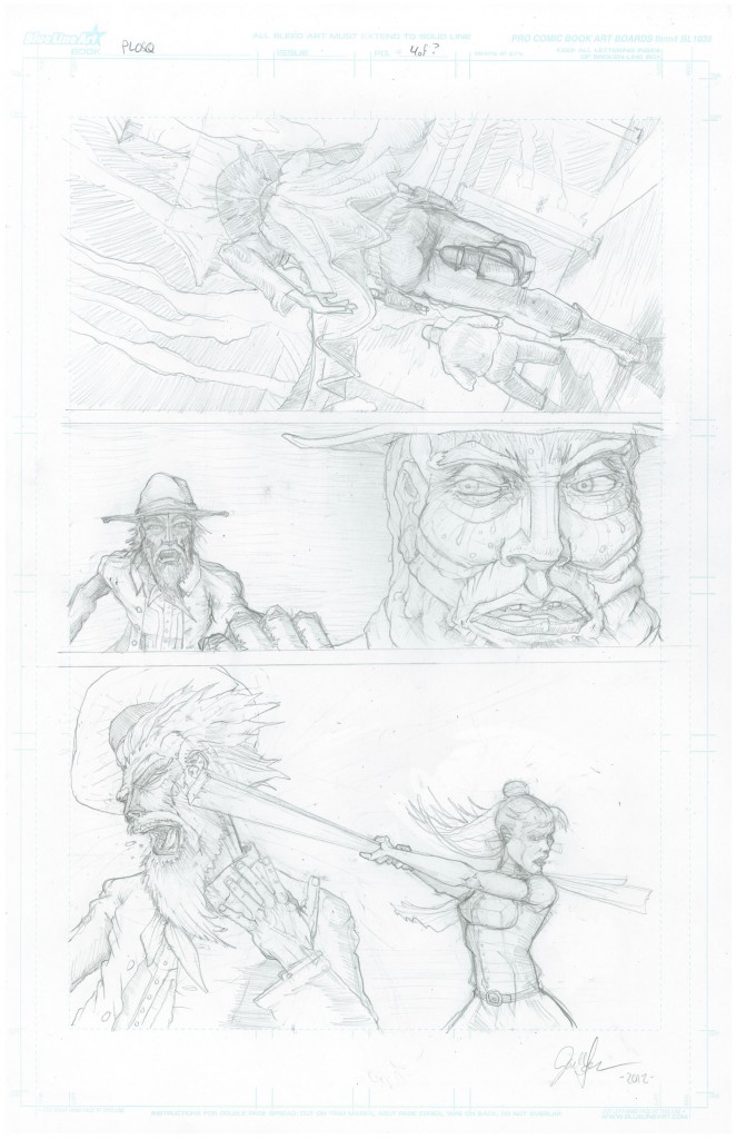
Page 4 of 22 is now 100% inked- this page had some great texturing, with an experimental textured technique that pays homage to the incredible pen and ink techniques of Edward Gorey  since I am a big fan of his parallel line style, I wanted to put my spin on his style of penwork, I think it succeeded in giving this panel a unique look to the rear parts of the shadowed characters.  Stipling and linework added some really detailed facial work on panels 2 and 3 to the foreground characters.  Finally a gradation in the stipled background to focus on the action in panel helped highlight the original pencil work.  I was going to use a manga style “kinetic” background but went in a more traditional direction in the style of the woodcut/old time art of the rest of the story I have been going for since the cover artwork. 

Now the biggest issue of this page was Jessica in Panel #3- I struggled with this, and Nate Stemen and Joe Freistuhler tried to tell me it was off, and while I tried to fix it, I didnt get it, and my good friend Dani Kaulakis really called it out, so I had to do some surgery with Kristen at Jaru to do a new piece of art and then superimpose it over panel 3 to get it right – the original inked panel #3 Jessica was too far gone, but I think the new piece is killer and I’m glad I did th work to change it- thanks Dani and Kristen!!

Im including the original pencils- to the bad first ink on panel #3 and the whole repair process to the new page- enjoy the process!


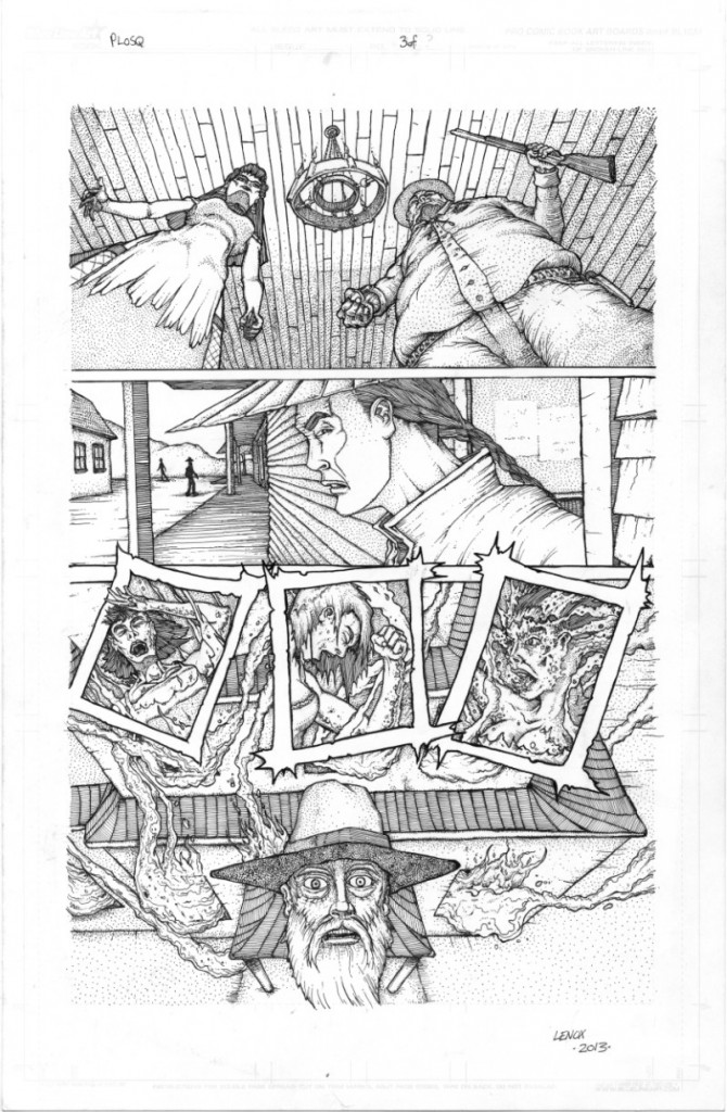
Painted Ladies of San Quentin; Page 3- Final Inks

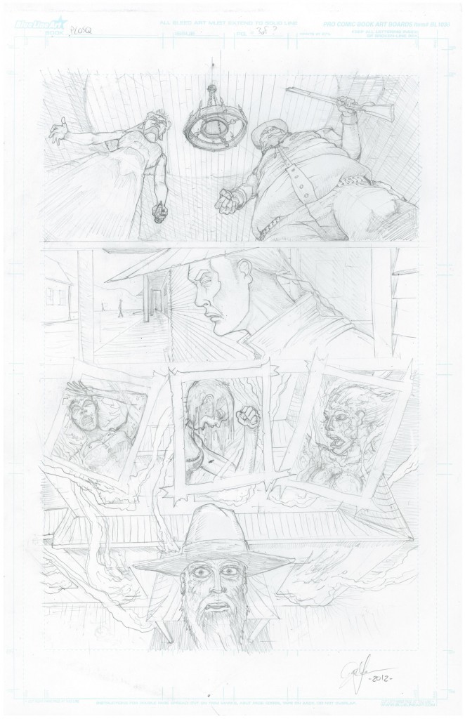
Page 3 of 22 now is 100% inked- this page ended up being a nightmare of architectural proprtions, T&G shadowed ceilings, wood siding, over head shot of a terra cotta building burning, multiple facial emotion shots and three burning women… and yet – it turned out gorgeous (in my opinion) what do you think?


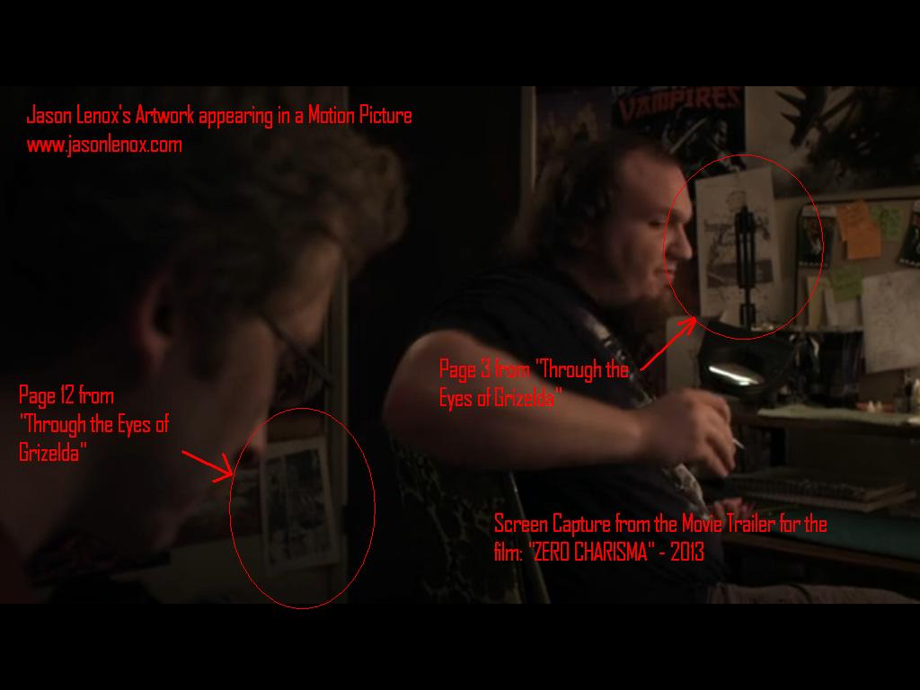
Zero Charisma- Grizelda Artwork used in Film- Screen Cap from Trailer

The Trailer finally came out for “ZERO CHARISMA” and my artwork did make it into the film!  Here is the screen cap from the trailer, my work is at the 1:02 minute mark behind actor Sam Eidson’s Character in his room, tacked on the wall- Grizelda goes Hollywood, just a little bit…  Enjoy this, I certainly did!

Trailer and fundraiser is at

http://www.indiegogo.com/zerocharismathemovie

Pages 3 and 12 that are in the screen capture…


WP Like Button Plugin by Free WordPress Templates