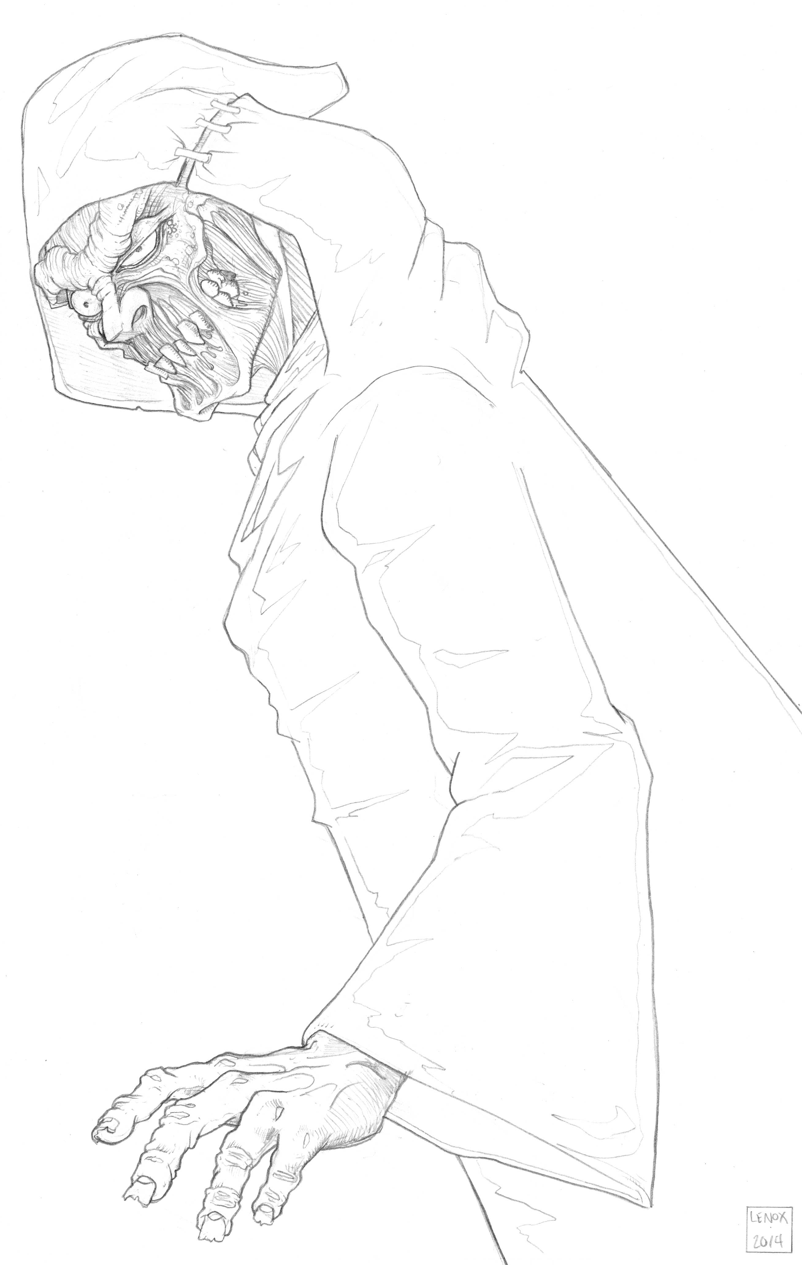
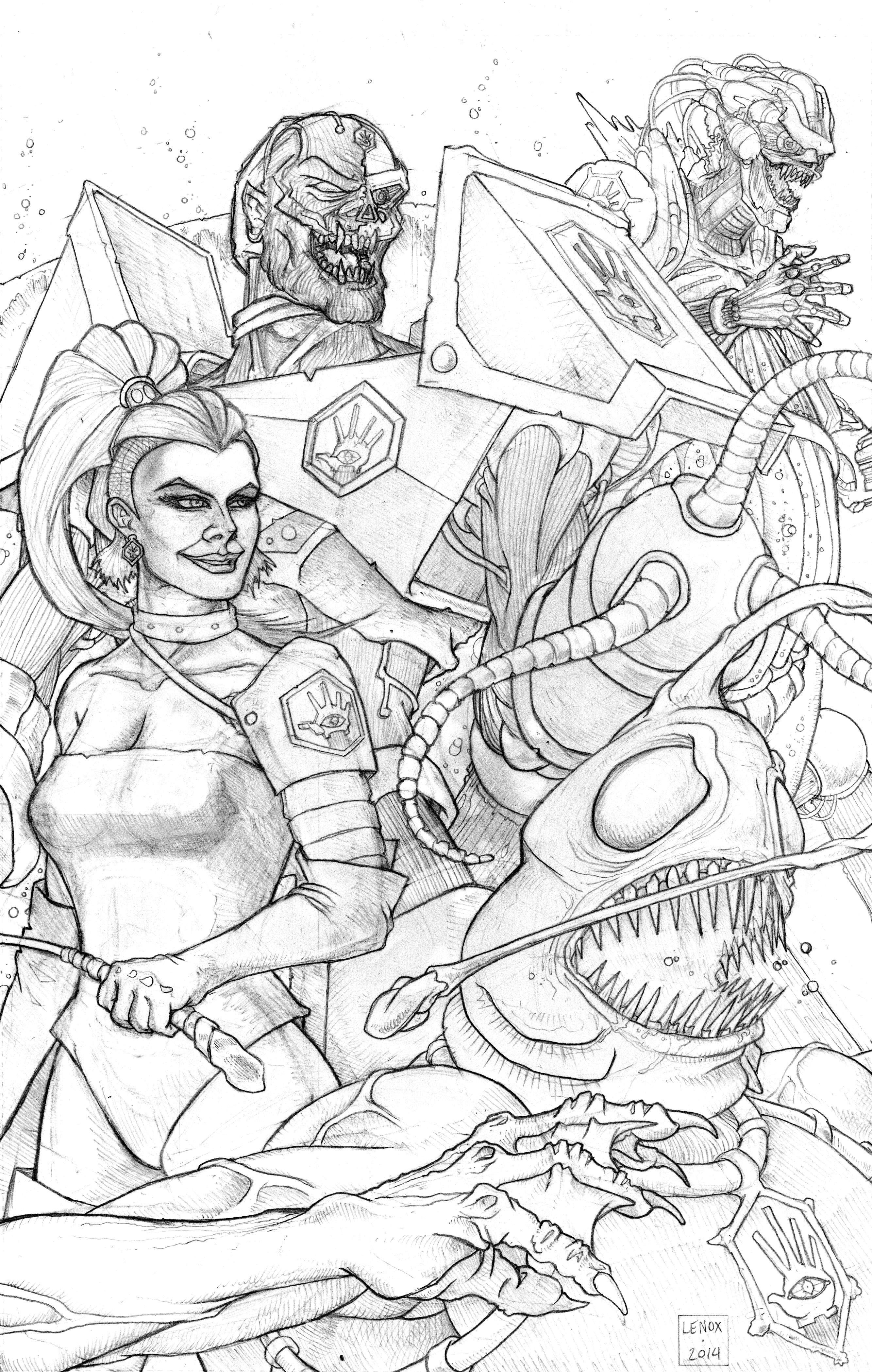
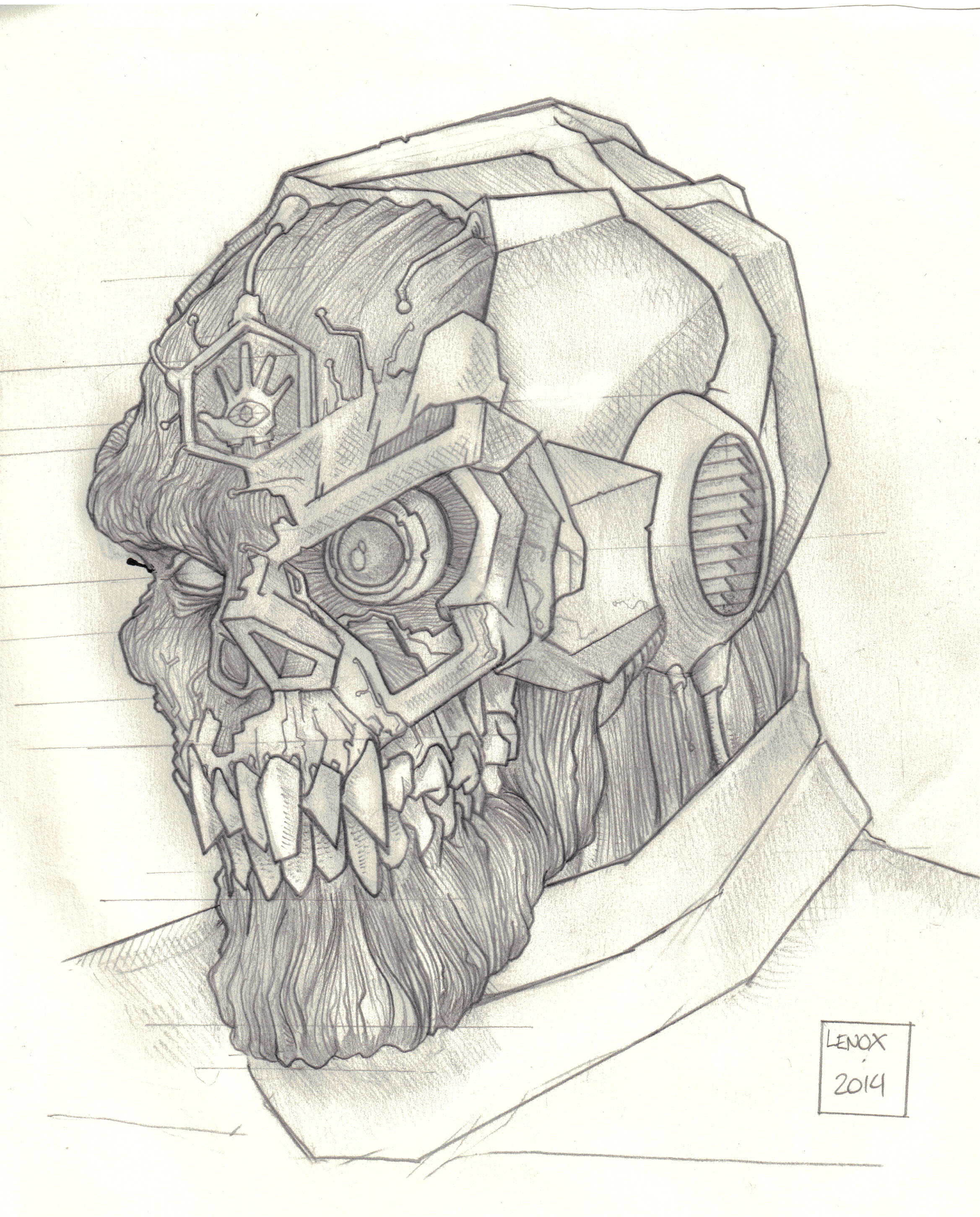
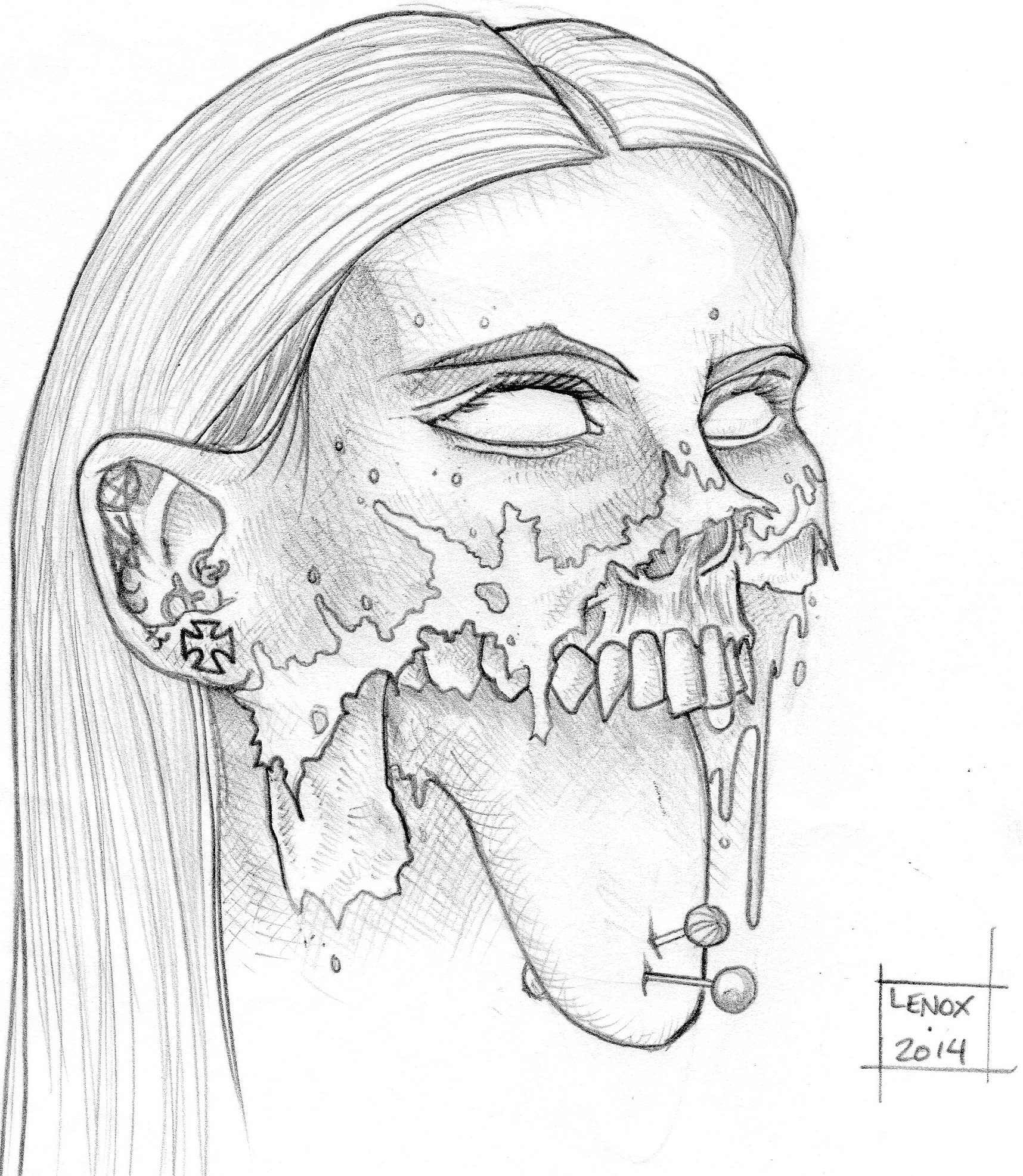
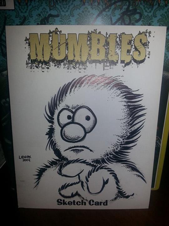
From last weekend- some outlandish commissions- Much love to Ashley and her work keeping my friend GREEN MAN’s Memory alive!
The final inks on this logo, the black contrasting back ground to the light rings showcase the sword and planet. The stippling gave a great texture to the planet Aiden, and the sword hilt really popped with those simple shapes.
I also made a few corrections on the ring dimensions as well from the pencil phase.
Now that the UMEX and LOTC logos are done, they really have that opposing visual style that I liked from Command and Conquer’s NOD and GDI insignias. Similar, but diametrically different!
On to some character designs now from the story bible!
Final Pencils for my next “LORDS OF THE COSMOS” artwork. This is the Heroes Logo-“The Lords of the Cosmos” . The planet Aiden and the Sword of the Hero “Aegeus” are the featured elements in this insignia.
I felt this showed the heroic nature of the protectors of the planet and was a great contrast visually and from a graphic arts perspective an opposite design to the Cybernetic hand of Umex I just completed prior to this. Using a triangle and different shapes and elements to the villains logo provides a visual contrast to the different factions in the world of Aiden we are building.
One note- Rings around a planet- very hard to get even close to looking correct! I think this will be a fun piece of artwork to ink… so keep your eyes peeled.
Extreme contrasts from black to white really made this insignia stand out. The plain flesh of the hand with the obsidian background are offset by the high contrast micro details in the circuit wrist and electrical eye. I really think when this graphic is plugged into some characters costumes it will all come together as I am laying the graphic arts groundwork on the new “LORDS OF THE COSMOS” Project with the most basic of components- the logos for our villains, and next the heroes!
The first piece of graphic design for my new project “LORDS OF THE COSMOS”. This is the logo for the Villains- the “Disciples of Umex”
A Mechanical Hand covered in artificial skin, with a vast mechanical eye staring outwards outlined by a hexagon.
This is the symbol of the Terrorist Army which is led by their Master: the Biological and Mechanical Terror known only as “Lord Umex”.
The logo could be worn as jewelry, branded into skin, carved into stone, or engraved on metal armor in his army of bio-mechanical/magic wielding/whip carrying/monstrous soldiers. The people of the Planet Aiden view this symbol with abject horror in my upcoming story as the back story of this group of “divine evil” brings havoc to the civilian population.
As a project visual architect, getting the logo and basic design down first is important when world building, Dennis Fallon and Jason Palmatier have been working on the character bible and scripts for about 7 months now, so I am getting started up (or caught up) on the art chores to bring the story of “LORDS OF THE COSMOS” to life- keep an eye out for more artwork and updates as I get time to create them!
This piece seemed like it took FOREVER, and yeah back to work, family, home shows for my regular job, comic shows etc. etc. all got in the way. However the end result turned out to be, well outstanding. Yes I called my own work outstanding, because I really like this piece.
Took the CONFORM sign out, it started to make a tangent, really worked the crazy textures on the ghoul’s skin and veins, and just really took my time to deliver the artwork that I wanted to see from this classic movie.
Not much else to say except…
“I’ve got one that can see….
He’s a tall, Caucasian male….
Unarmed, wearing sunglasses….”
Copyright © 2025, Jason Lenox. Proudly powered by WordPress. Blackoot design by Iceable Themes.