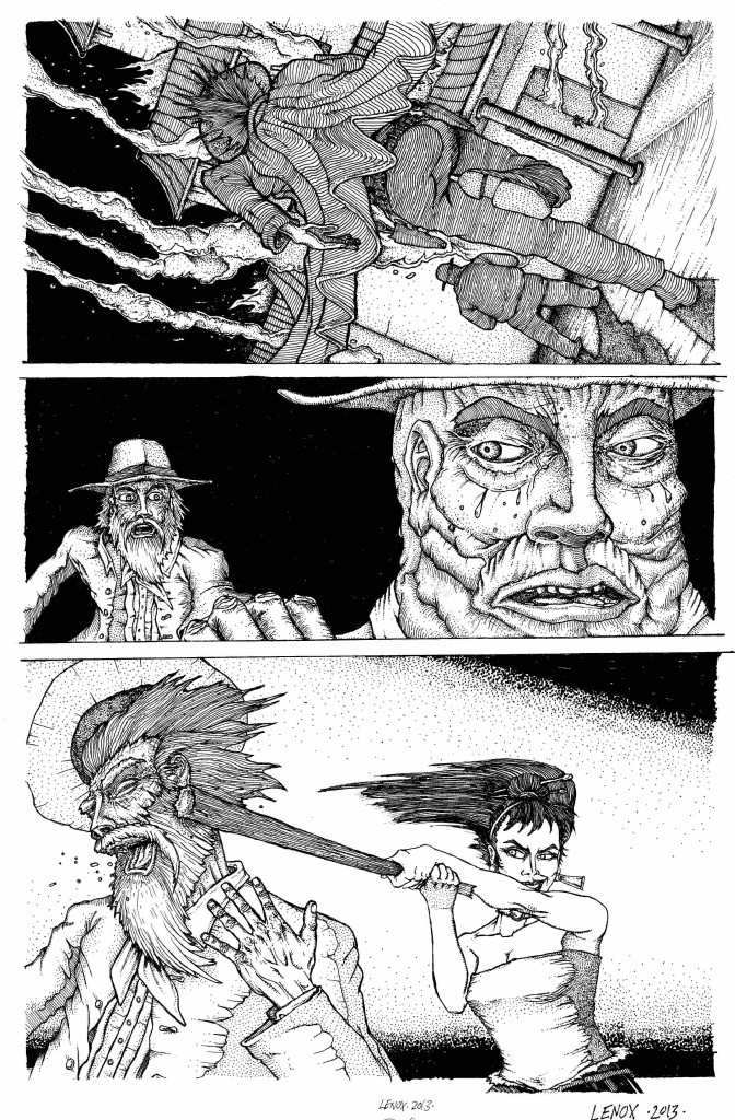
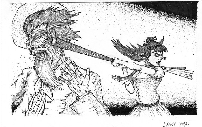
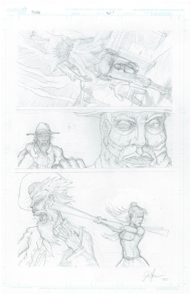
Page 4 of 22 is now 100% inked- this page had some great texturing, with an experimental textured technique that pays homage to the incredible pen and ink techniques of Edward Gorey since I am a big fan of his parallel line style, I wanted to put my spin on his style of penwork, I think it succeeded in giving this panel a unique look to the rear parts of the shadowed characters. Stipling and linework added some really detailed facial work on panels 2 and 3 to the foreground characters. Finally a gradation in the stipled background to focus on the action in panel helped highlight the original pencil work. I was going to use a manga style “kinetic” background but went in a more traditional direction in the style of the woodcut/old time art of the rest of the story I have been going for since the cover artwork.
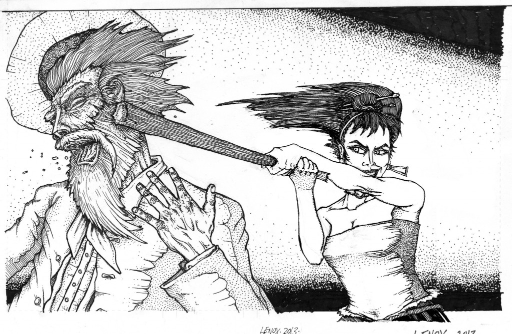
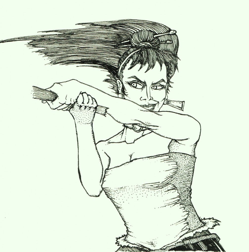
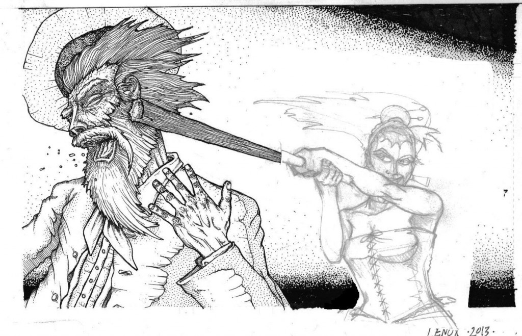
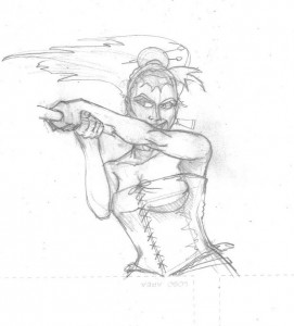
Now the biggest issue of this page was Jessica in Panel #3- I struggled with this, and Nate Stemen and Joe Freistuhler tried to tell me it was off, and while I tried to fix it, I didnt get it, and my good friend Dani Kaulakis really called it out, so I had to do some surgery with Kristen at Jaru to do a new piece of art and then superimpose it over panel 3 to get it right – the original inked panel #3 Jessica was too far gone, but I think the new piece is killer and I’m glad I did th work to change it- thanks Dani and Kristen!!
Im including the original pencils- to the bad first ink on panel #3 and the whole repair process to the new page- enjoy the process!

