Hey check out the video that SAS Multimedia Studio produced to support the KICKSTARTER campaign to get the “Through The Eyes Of Grizelda” completed, and hopefully published!
You can visit the link at Grizelda Kickstarter – thanks!

Hey check out the video that SAS Multimedia Studio produced to support the KICKSTARTER campaign to get the “Through The Eyes Of Grizelda” completed, and hopefully published!
You can visit the link at Grizelda Kickstarter – thanks!
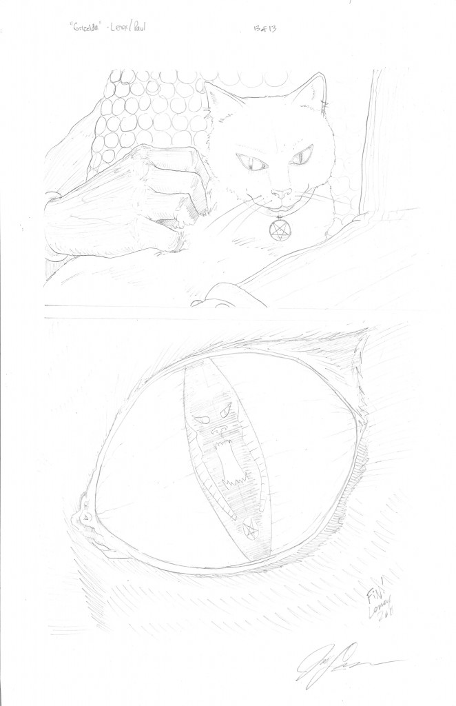
This is the final page of the “Through the Eyes of Grizelda” project. I really liked the peace and calm of this page compared to the high action/violence of the prior pages. It was a nice “book end” to the first page which started with the Cat’s Eye- to Grizelda sitting, to this page with Grizelda sitting (and getting petted- the motive for all of her actions!) to the final shot of the closeup of the Cat’s eye and the Great Beast to close it out. Also, I really was happy with the closeup of the wrinkled skin of the Necromancer, It turned out to be creepy like I wanted it to. The Kickstarter Campaign to bring this to a final colored state should be out shortly, and feel free to comment on this project- thanks!

Another page closer to the end, and one to go! This was a very labor intensive page. Some notes of interest- I left Grizelda as a photo negative “white” as opposed to her normal black in the transformation panel on the left. I also felt this as a good counter image to the first transformation scene. I tried a new kind of stipling on the right panel at the bottom smoke, and the fire chalice at the top, I was pleased with the effect. Also, I added my friend Don Carpenter as the bottom Left Zombie soldier, I altered the appearance to look like him, if he was an undead soldier. Congratulations Don, you are now a mindless servant of Evil!
I really tried to get some creative and different camera angles on here, and I think it worked. Our Hero meets his ultimate fate, and we see just how much of a bad ass our Necromancer is, This page just clicked. The healing arm really caught a touch of Albrecht Durer’s style in the B&W, in my humble opinion.
This is one of the toughest pages in “Grizelda”- from the architecture in the background on the first panel, to counting all out 11 victims from the group shot on top- to their individual deaths in the next few panels- they are all there! I messed up the great beast’s face and was not able to fix it in my first attempt to ink this page, however, I made a new face separately, and JARU “Super Digital Goddess” –Kristin, just took my separate image (below- 2nd from top image) and placed it perfectly on the main image- problem solved for the final Black and White image for page 10. I also thought the individual kill panels looked sweet as well on panels 2-5.
Another labor intensive page- Really pushed the use of negative black space to make the magic effects stand out a bit more, I was pleased with the result. Also the cat transformation was not as intended with more black space on the right side, but I liked how it turned out as being “uneven” with the transformation effect being different on each side of the dissolving head. Also, I loved how the Necromancer’s robe/skirt turned out, it really got a nice “fabric” wrinkled look to it.
Page 8 India Ink update on “Grizelda”- did some real work on the melted heroes in the top panel under the Necromancers feet, and made the heroes more detailed than the pencils that are attacking him. Also did the same cobblestone technique from the prior page. On the bottom panel- did some work on the arm to make it less stiff (one swinging the sword).
This is the page 7 India Ink progress for “Grizelda”- I tried a new technique for the magic blast (acid vortex?!) from the Necromancer on his foes. I thought it had a nice effect, and I think the colorist will bring out the final vision there. I also liked the cobble stone floor, and the guy the cat is standing on in the foreground.
Copyright © 2026, Jason Lenox. Proudly powered by WordPress. Blackoot design by Iceable Themes.