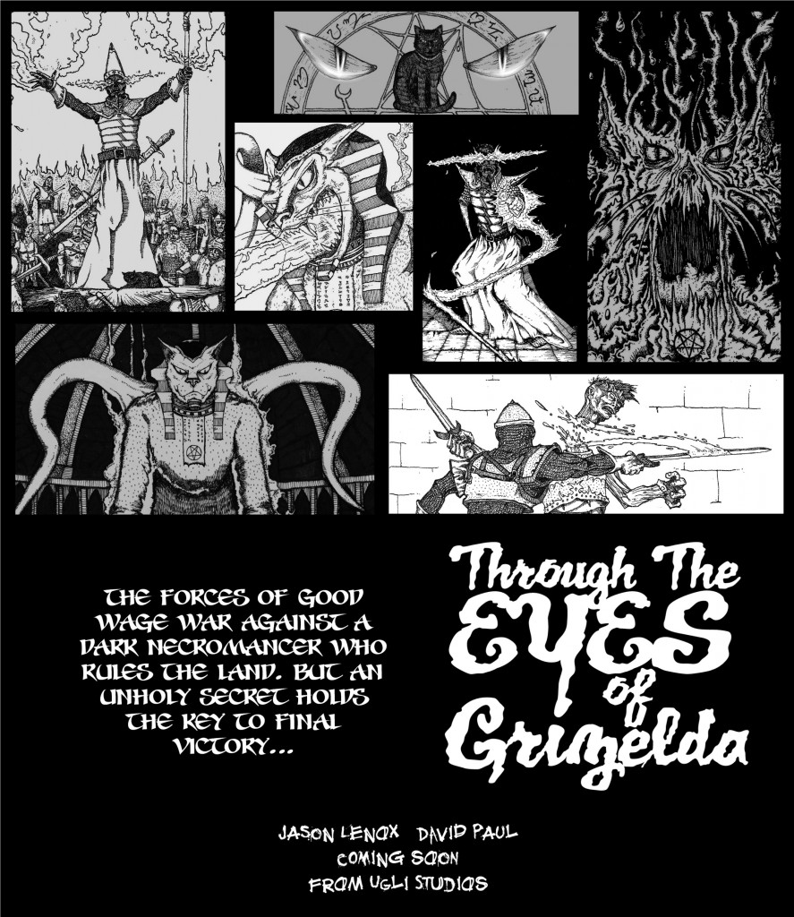
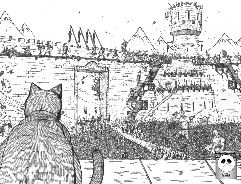
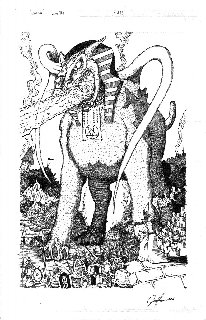
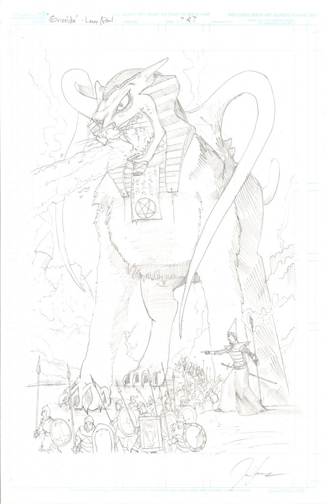
What else can I say about this awesome promotional piece made by the Wizard of Words, David Paul? The work speaks for itself. Thanks David for making this outstanding poster, Hell- I want to go out and buy this right now!!
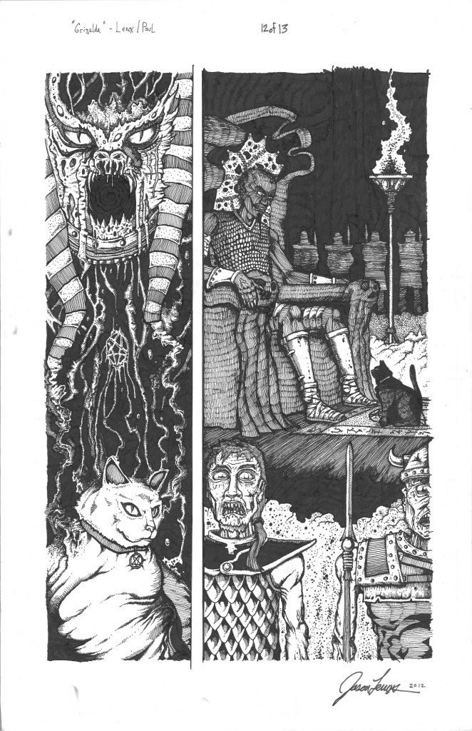
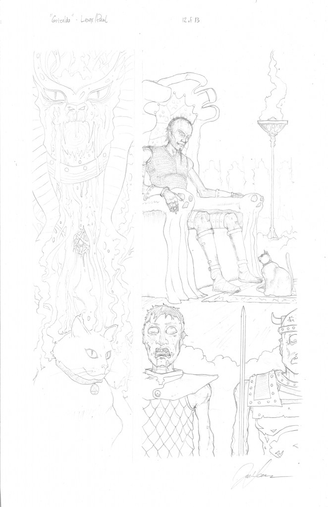
“Grizelda” Page 12, Inks
Another page closer to the end, and one to go! This was a very labor intensive page. Some notes of interest- I left Grizelda as a photo negative “white” as opposed to her normal black in the transformation panel on the left. I also felt this as a good counter image to the first transformation scene. I tried a new kind of stipling on the right panel at the bottom smoke, and the fire chalice at the top, I was pleased with the effect. Also, I added my friend Don Carpenter as the bottom Left Zombie soldier, I altered the appearance to look like him, if he was an undead soldier. Congratulations Don, you are now a mindless servant of Evil!
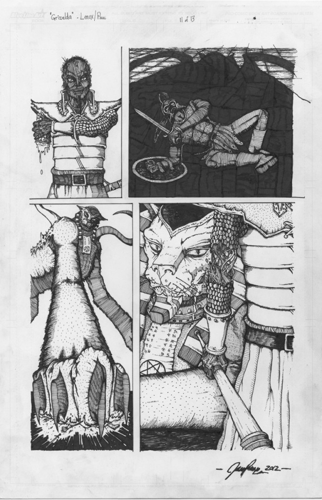
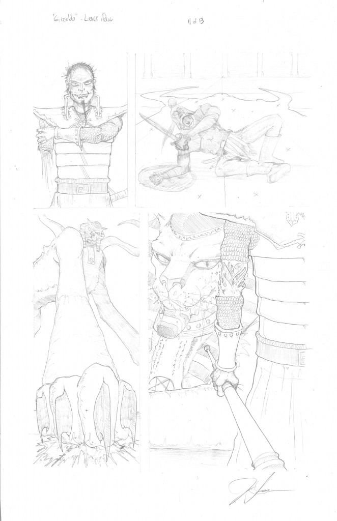
“Grizelda” Page 11, Inks
I really tried to get some creative and different camera angles on here, and I think it worked. Our Hero meets his ultimate fate, and we see just how much of a bad ass our Necromancer is, This page just clicked. The healing arm really caught a touch of Albrecht Durer’s style in the B&W, in my humble opinion.
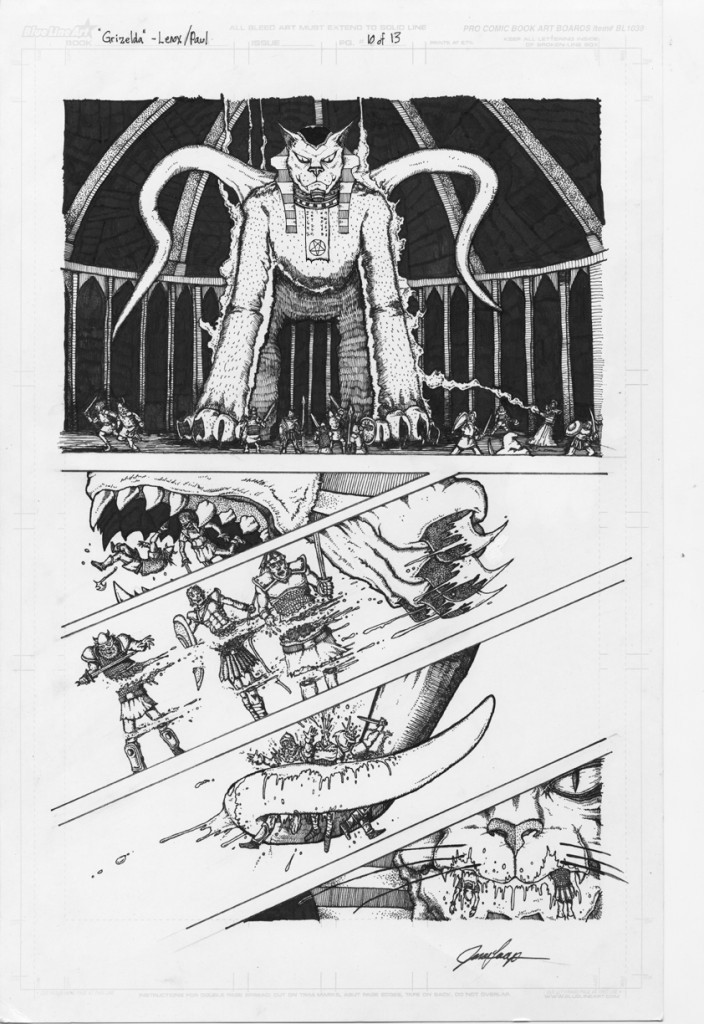
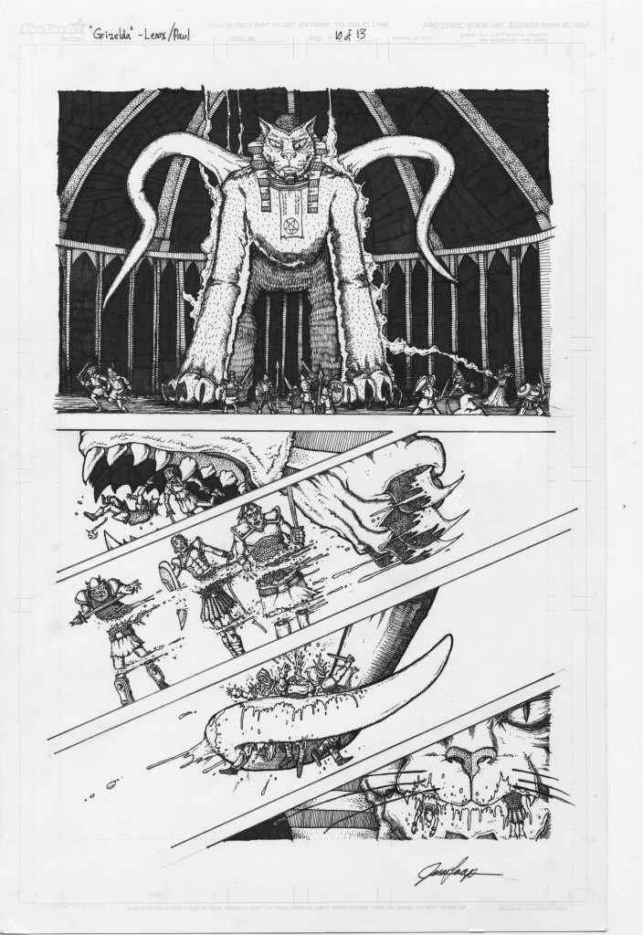
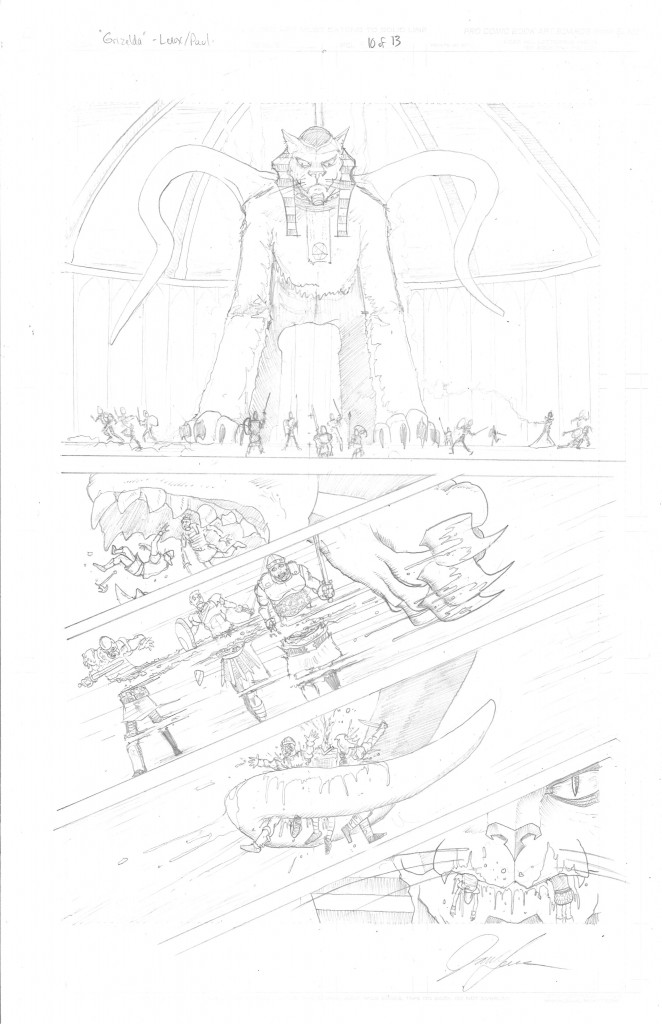
“Grizelda” Page 10, Inked
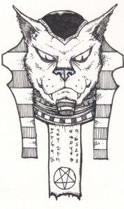
This is one of the toughest pages in “Grizelda”- from the architecture in the background on the first panel, to counting all out 11 victims from the group shot on top- to their individual deaths in the next few panels- they are all there! I messed up the great beast’s face and was not able to fix it in my first attempt to ink this page, however, I made a new face separately, and JARU “Super Digital Goddess” –Kristin, just took my separate image (below- 2nd from top image) and placed it perfectly on the main image- problem solved for the final Black and White image for page 10. I also thought the individual kill panels looked sweet as well on panels 2-5.
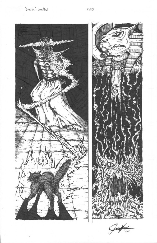
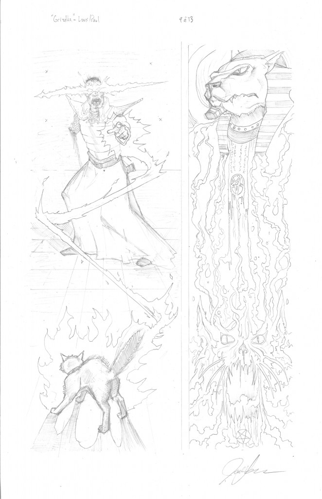
“Grizelda” Page 9, Inks
Another labor intensive page- Really pushed the use of negative black space to make the magic effects stand out a bit more, I was pleased with the result. Also the cat transformation was not as intended with more black space on the right side, but I liked how it turned out as being “uneven” with the transformation effect being different on each side of the dissolving head. Also, I loved how the Necromancer’s robe/skirt turned out, it really got a nice “fabric” wrinkled look to it.
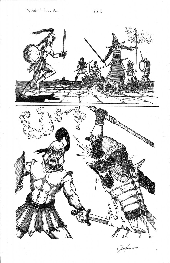
“Grizelda” Page 8, Inks
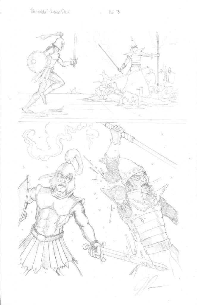
Page 8 India Ink update on “Grizelda”- did some real work on the melted heroes in the top panel under the Necromancers feet, and made the heroes more detailed than the pencils that are attacking him. Also did the same cobblestone technique from the prior page. On the bottom panel- did some work on the arm to make it less stiff (one swinging the sword).
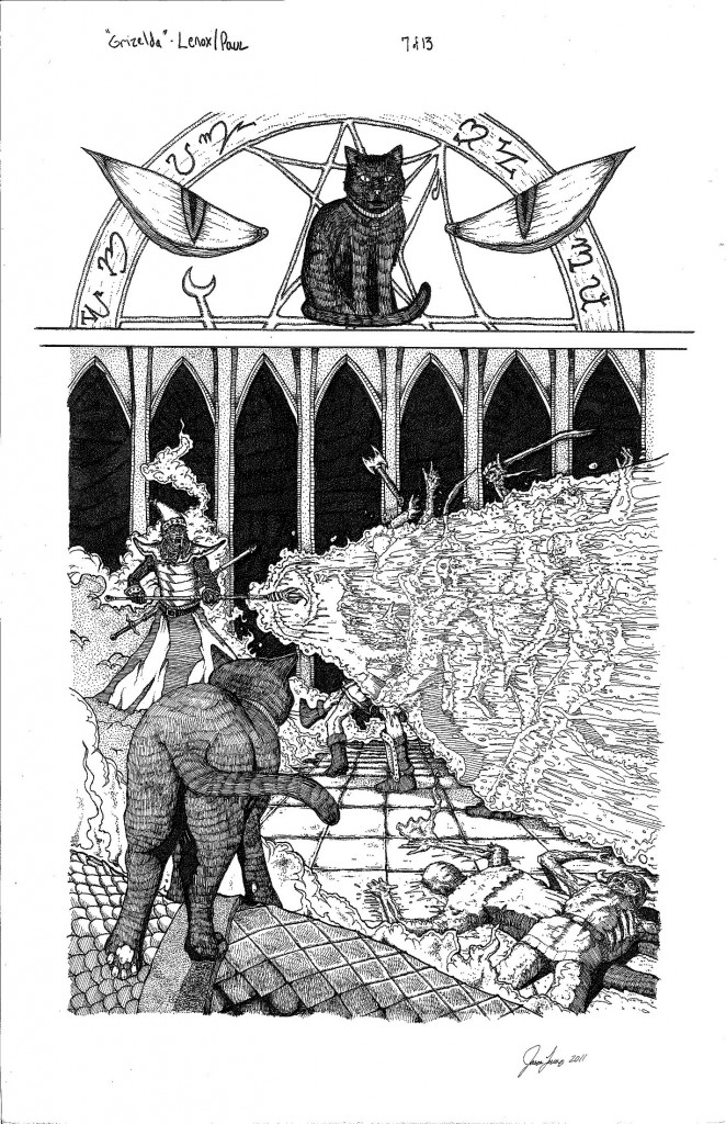
“Grizelda” Page 7, Inks
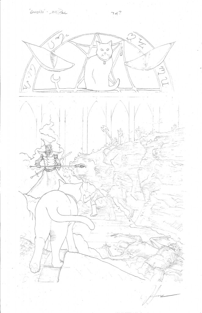
This is the page 7 India Ink progress for “Grizelda”- I tried a new technique for the magic blast (acid vortex?!) from the Necromancer on his foes. I thought it had a nice effect, and I think the colorist will bring out the final vision there. I also liked the cobble stone floor, and the guy the cat is standing on in the foreground.
Social Media
Categories
- 30 Years Later
- Advanced Fighting Fantasy
- Book Cover Project
- Captain Anarchy
- Colored Work
- Commissions
- Dr. Who
- Figure Drawing
- FUBAR
- Gathering Anthology
- H.P. Lovecraft
- Hiatus
- Jason in the News
- Kantara
- Logos/Promotional Work
- Lords of the Cosmos
- Masters of the Universe
- Miscellaneous
- Music
- Mythological Creatures
- Painted Ladies of San Quentin
- Pen & Ink
- Pencil Work
- Role Playing Games
- Satanic Artwork
- Sequential Work
- Tattoos
- Tee Shirt & Fashion Art
- The Great Vermin
- Through the Eyes of Grizelda
- TPK Games
- UGLI studios
- Viper Comics
- What's New
- Zero Charisma
Pages
Cool people Jason works with
Jason Lenox Conventions
Jason Lenox's Retailers
Lenox's Recommended Links
More about Jason Lenox

