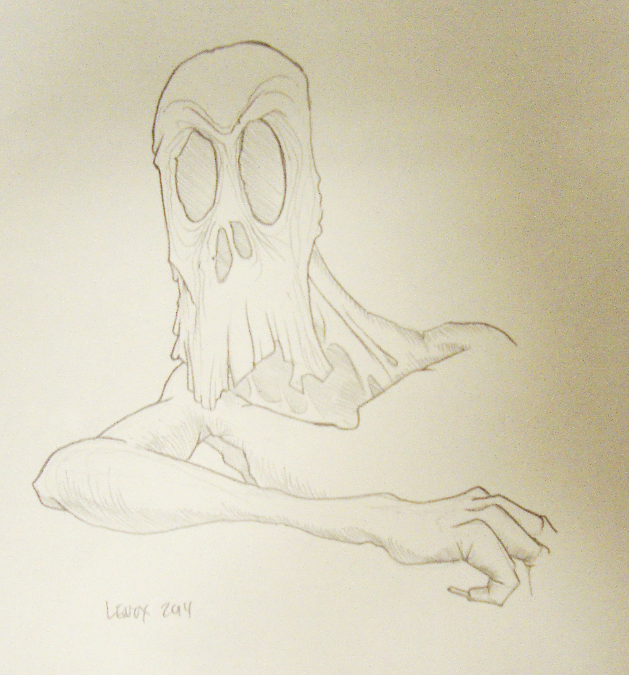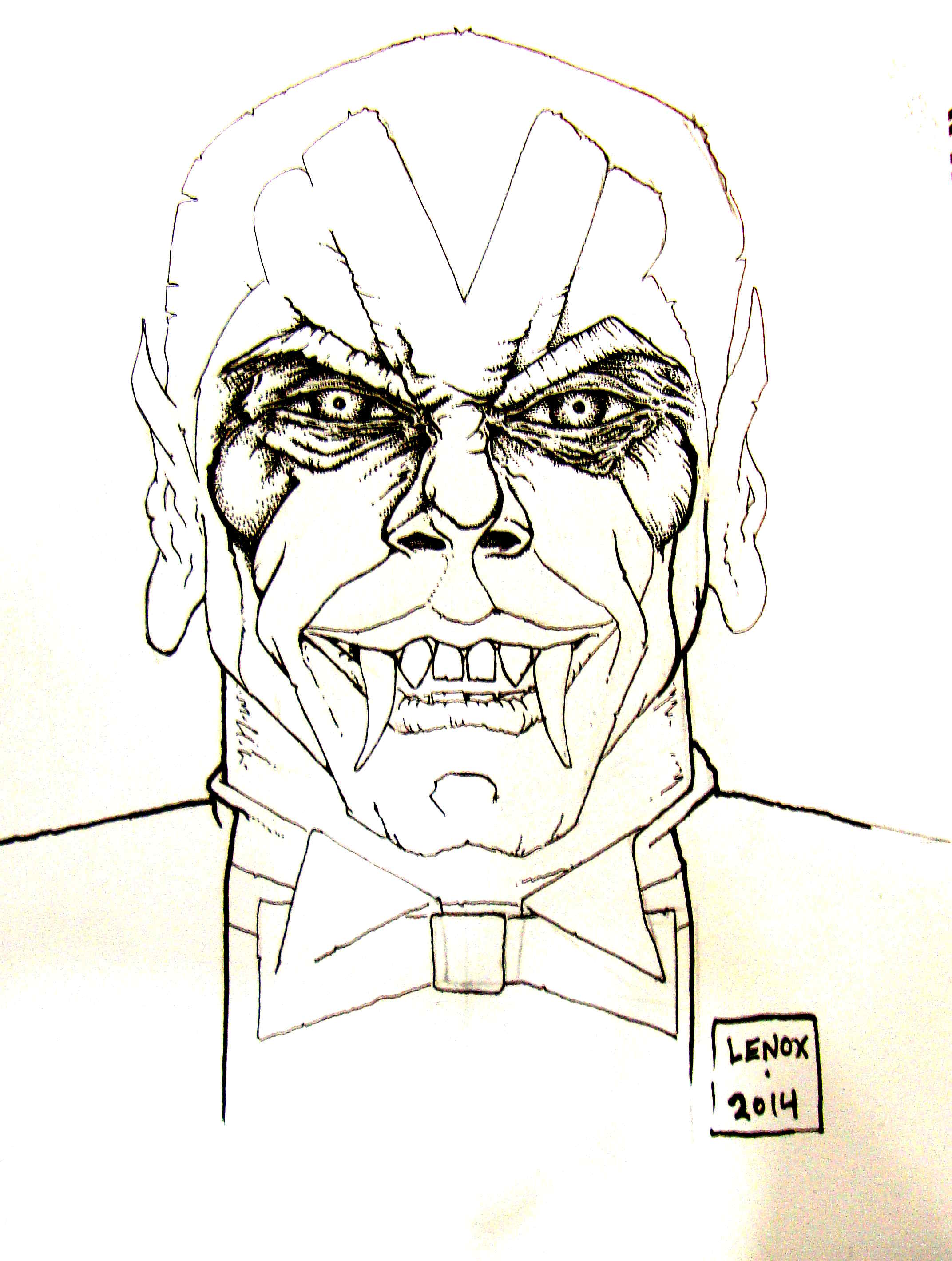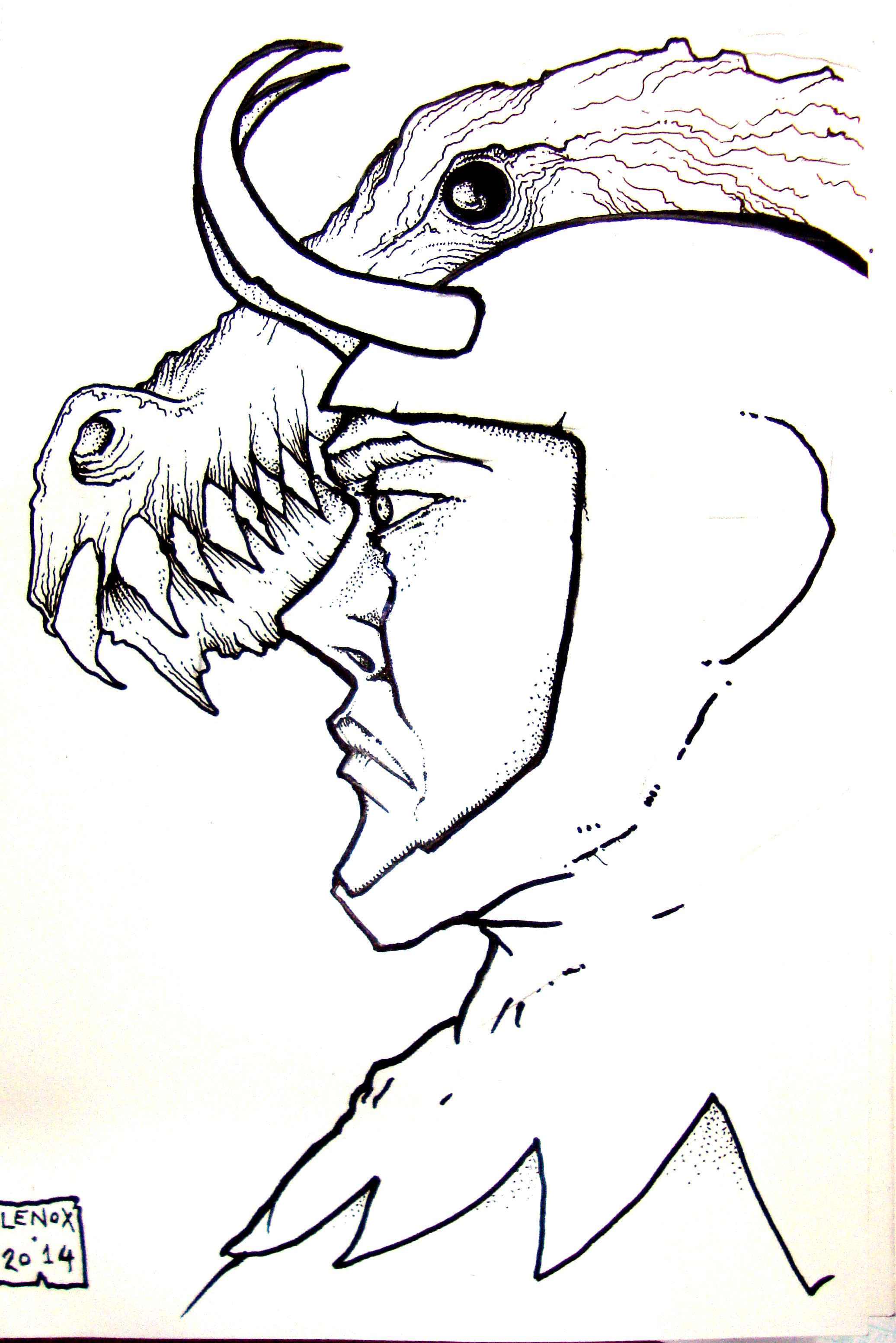
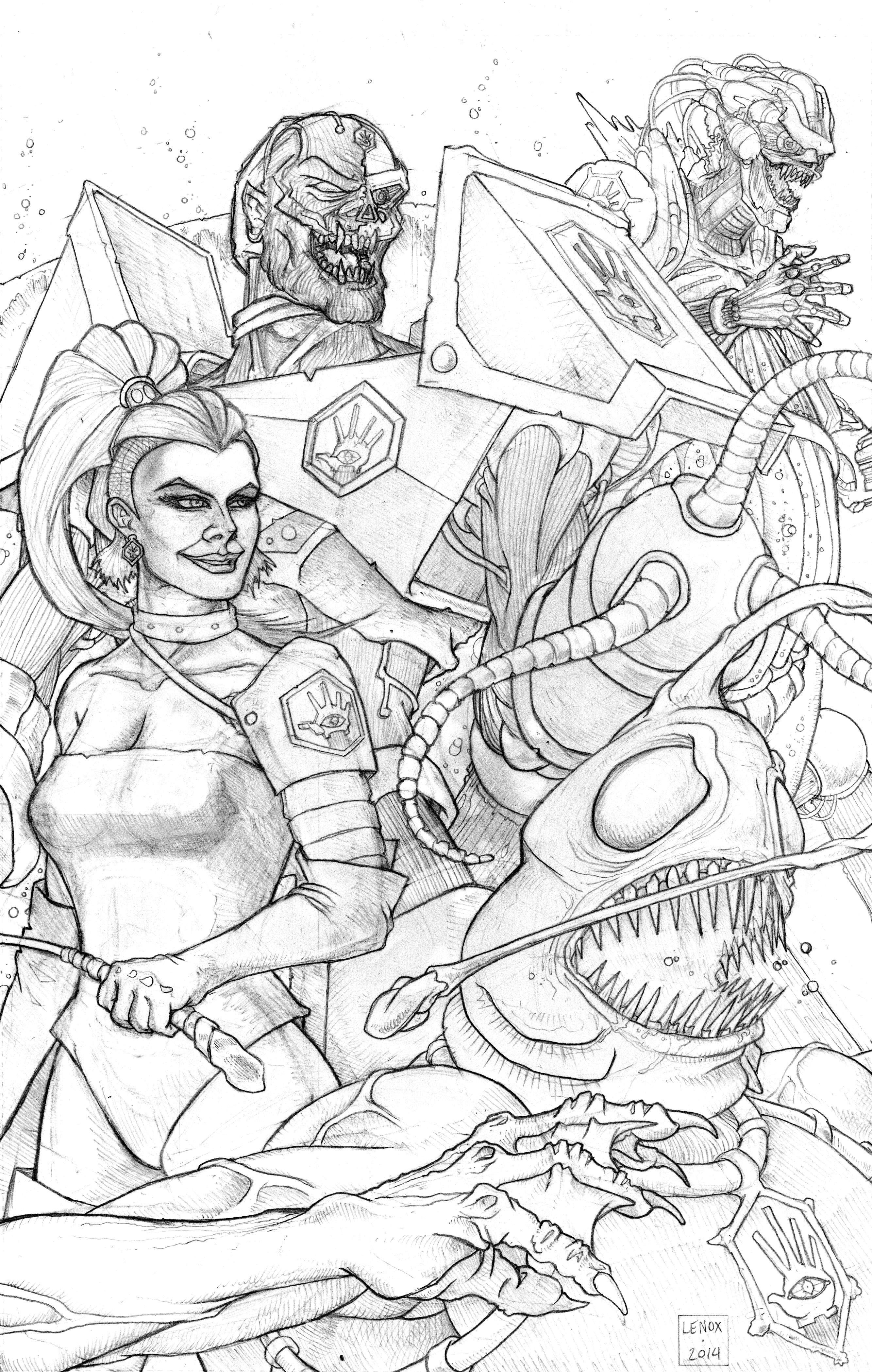
The Villains of LORDS OF THE COSMOS in their first pinup- the pencils were wrapped on this last night, so it’s exciting to share this finally since the layout for this project has been in my head for the last five months or so waiting to get out.
“THE DISCIPLES OF UMEX”
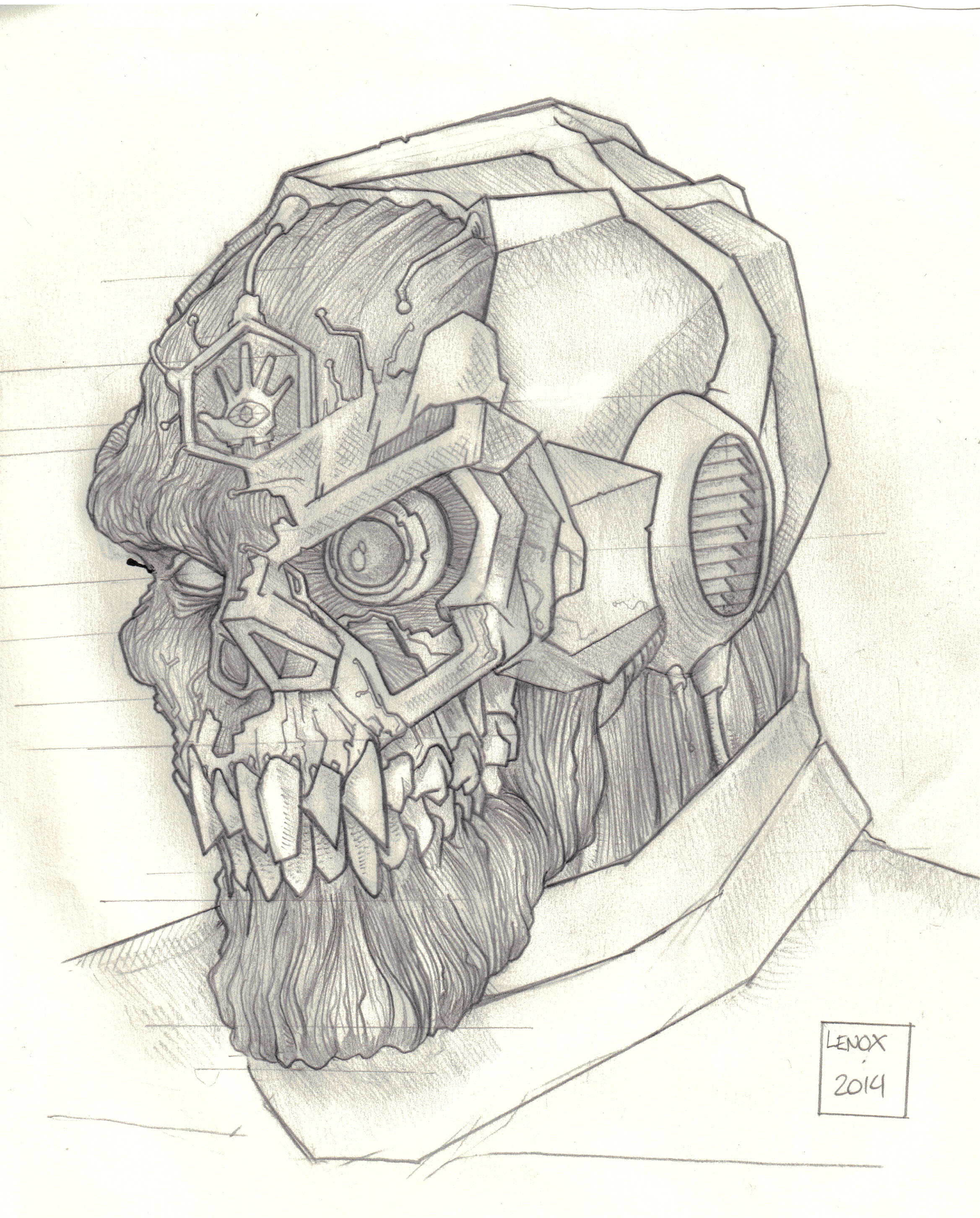
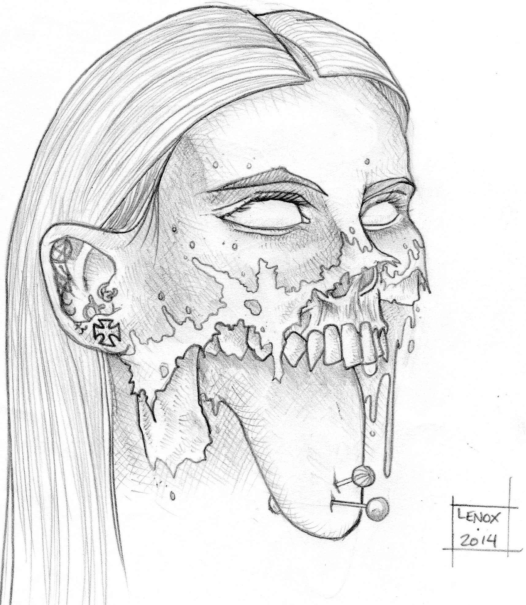
The artwork features the Evil Leader UMEX- part machine and part biological weapon he leads his henchmen to their goal of world wide anarchy and destruction….. The Flesh Eating Acid Vat MORDANTIX, The Pain Worshipping MISTRESS ZEMBA, and the Aquatic Killer SHREDTOOTH are just some of his followers- ready to kill or be killed at his command!
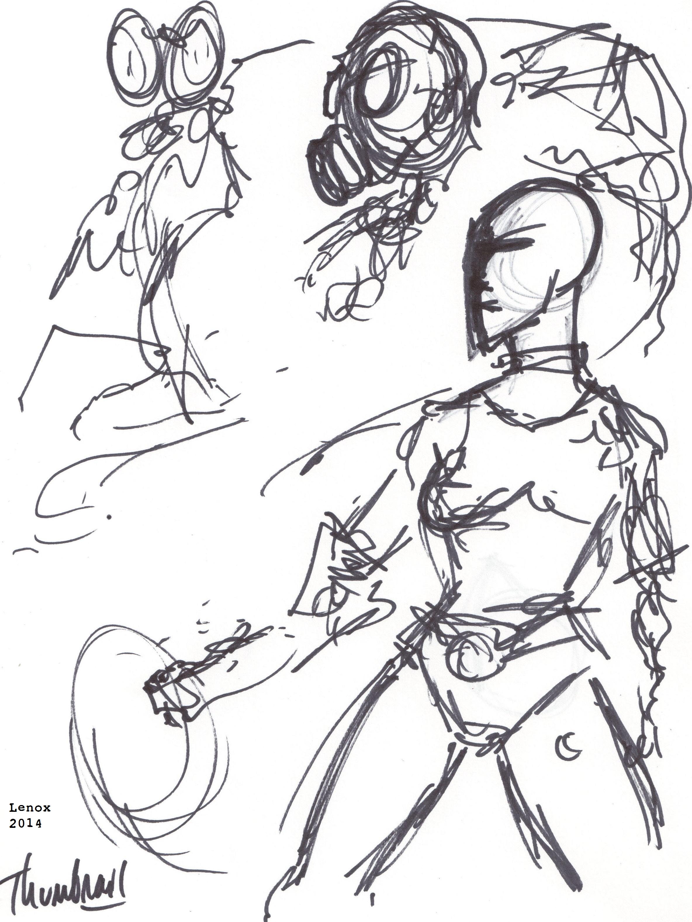
The original idea and composition is in the lower image which is just a basic layout of the overlapping characters moving from side to side. I ended up changing the direction, the middle character went from a henchman to the main villain, and I reversed direction from right to left, to left to right. I had been working on Umex’s complex design so much (see prior post here about his character) that I felt he needed to be the centerpiece of the entire layout. Also the Umex Logo was featured everywhere on the characters, so you can see why I took the time here to get the all seeing eye inside the mechanical hand done before I started any of the pinups. The Umex logo artwork is here in inks, and here in pencils. Now that the relationship between the graphic design element of the insignia is with the actual villains, I am glad I took the time to really get that basic visual touchstone correct.
It was fun to take some of the artistic lessons I’ve learned in the last 10 months and put them to use on my first original characters since I wrapped “The Painted Ladies of San Quentin” around this time last summer. I look forward to working with the rest of the LORDS OF THE COSMOS universe in the coming months! For those of you that have talked with me about this project,I think you can see the vision just starting, and if you have no idea what this is about, talk to me about it sometime…
So Enjoy, and spread the word, and keep an eye out for the inked version of the artwork coming soon!
The original thumbnail composition