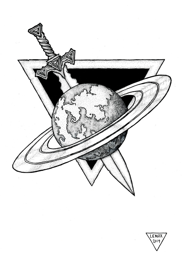
The final inks on this logo, the black contrasting back ground to the light rings showcase the sword and planet. The stippling gave a great texture to the planet Aiden, and the sword hilt really popped with those simple shapes.
I also made a few corrections on the ring dimensions as well from the pencil phase.
Now that the UMEX and LOTC logos are done, they really have that opposing visual style that I liked from Command and Conquer’s NOD and GDI insignias. Similar, but diametrically different!
On to some character designs now from the story bible!


