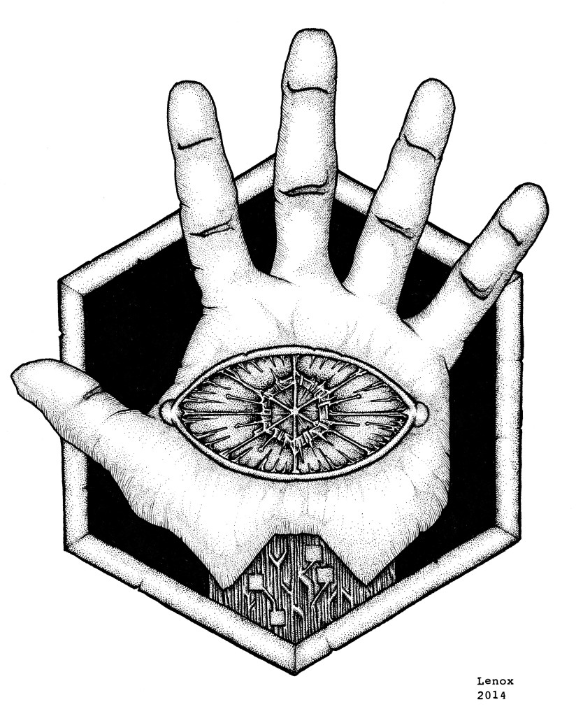
Extreme contrasts from black to white really made this insignia stand out. The plain flesh of the hand with the obsidian background are offset by the high contrast micro details in the circuit wrist and electrical eye. I really think when this graphic is plugged into some characters costumes it will all come together as I am laying the graphic arts groundwork on the new “LORDS OF THE COSMOS” Project with the most basic of components- the logos for our villains, and next the heroes!
1 Response to LORDS OF THE COSMOS: “Disciples of Umex” Logo – Final Inks
Leave a Reply Cancel reply
You must be logged in to post a comment.
This site uses Akismet to reduce spam. Learn how your comment data is processed.
Social Media
Categories
- 30 Years Later
- Advanced Fighting Fantasy
- Book Cover Project
- Captain Anarchy
- Colored Work
- Commissions
- Dr. Who
- Figure Drawing
- FUBAR
- Gathering Anthology
- H.P. Lovecraft
- Hiatus
- Jason in the News
- Kantara
- Logos/Promotional Work
- Lords of the Cosmos
- Masters of the Universe
- Miscellaneous
- Music
- Mythological Creatures
- Painted Ladies of San Quentin
- Pen & Ink
- Pencil Work
- Role Playing Games
- Satanic Artwork
- Sequential Work
- Tattoos
- Tee Shirt & Fashion Art
- The Great Vermin
- Through the Eyes of Grizelda
- TPK Games
- UGLI studios
- Viper Comics
- What's New
- Zero Charisma
Pages
Cool people Jason works with
Jason Lenox Conventions
Jason Lenox's Retailers
Lenox's Recommended Links
More about Jason Lenox


[…] eye inside the mechanical hand done before I started any of the pinups. The Umex logo artwork is here in inks, and here in pencils. Now that the relationship between the graphic design element of the […]