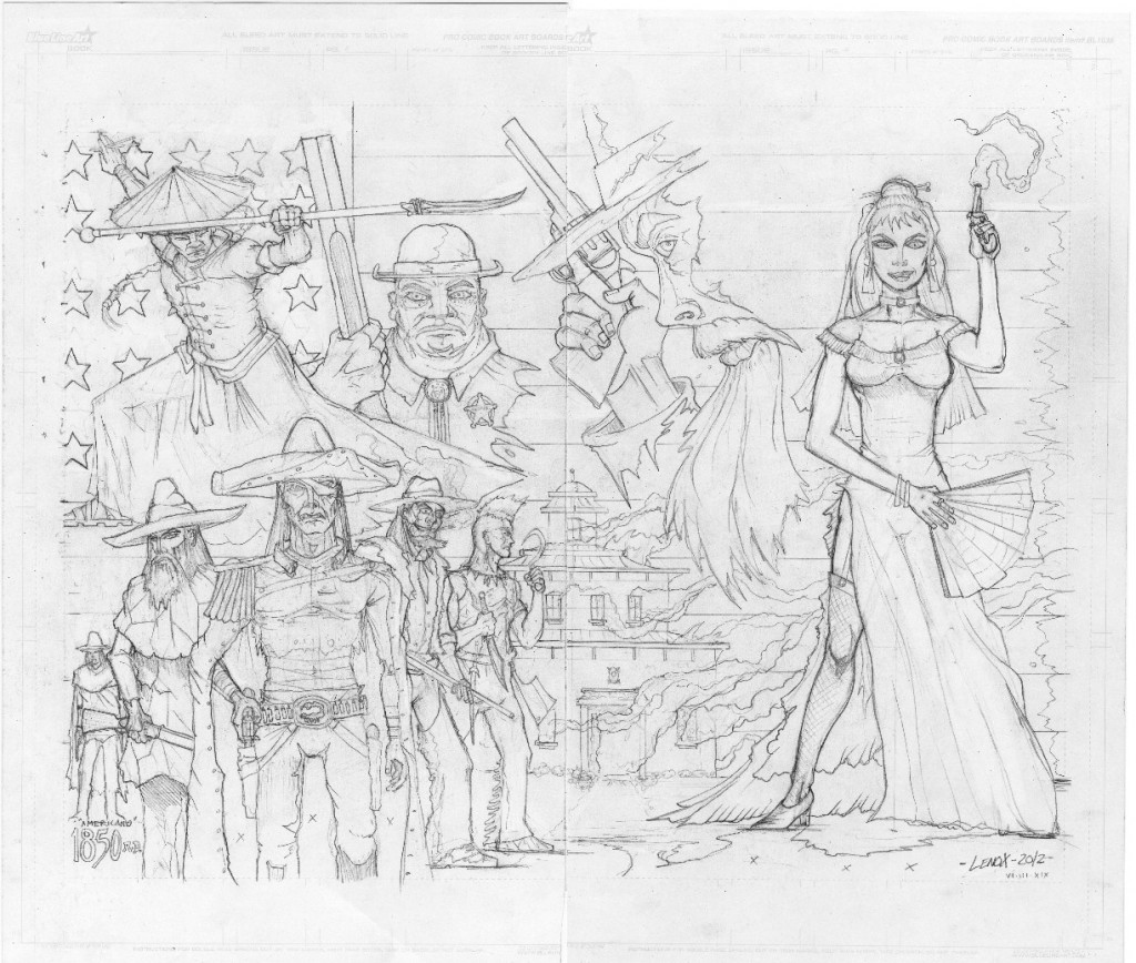
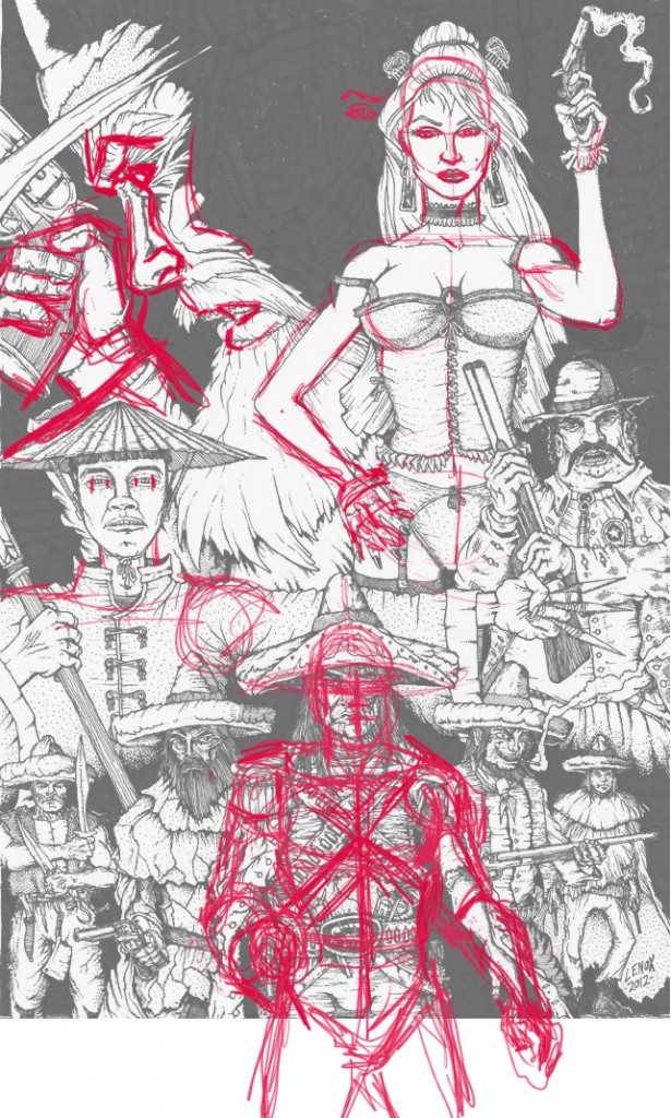
So I was not happy with the original artwork I did for this project (USP #2’s Cover)- there were several anatomy / proportion mistakes and the image was too crammed to show all of the stuff I wanted to show and ended up not having a good flow/composition. I made the decision to redo it as a gatefold two page cover (front and back) with an 1850 American Flag to join the whole image together to get the space to tell the story and introduce my characters without crushing them in too hard. And you can see my friend, and superstar artist, Jeff Lavezoli’s edits in red on the original artwork where he called out some of my errors with scale, anatomy and proportion-Thanks Jeff! I’m glad I took the time to redo it- this is now a strong piece, and something we can get really excited about as an image and a comic book cover for UGLI STUDIOS PRESENTS #2!!


